Find Your Way — Old City
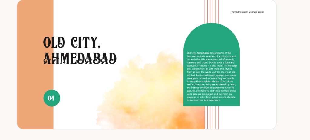
A heritage-aware wayfinding system for Ahmedabad’s UNESCO Old City — turning dense pols, markets, and monuments into a legible experience for visitors and locals without diluting character.
- Year :
- 2022
- Course :
- Design of Wayfinding Systems (Academic)
- Role :
- Field research, persona/journey mapping, visual direction (type, color, icons), sign form explorations, content hierarchy, materials & prototyping
- Project Duration :
- Aug–Nov 2022 · Ahmedabad
1)Brief & Objectives
Team
Studio team — Siya Parmar (research, moodboards, form development, physical model); Kashmi Shah, Sakshi Shah, Priyal Soni, Kavya Kanadia, Devanshi Shukla
Deliverables
Wayfinding handbook, sign family system, orientation map, bilingual content hierarchy, digital prototypes, placement & fabrication specs
Tools
Field audits, persona mapping, Illustrator, SketchUp, ACP + retro-reflective vinyl specs, foam/print mockups
The ask
Design a unified wayfinding and sign identity for the Old City that respects heritage while improving legibility at gateways, intersections, and points of interest.
Audience
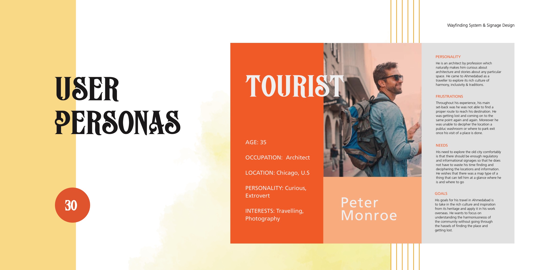
Heritage tourists on day trips, local shoppers parking-first, residents navigating pols, and drivers who need earlier parking diversion cues.
Goals
- •Orientation first — clear “You Are Here” and landmark logic at gateways.
- •Decision support — unmissable cues at forks and intersections.
- •Mobility clarity — Park & Walk nudges; rickshaw and foot zones.
- •Cultural fit — bilingual EN/GU, heritage-informed form, durable build.
Outcome snapshot
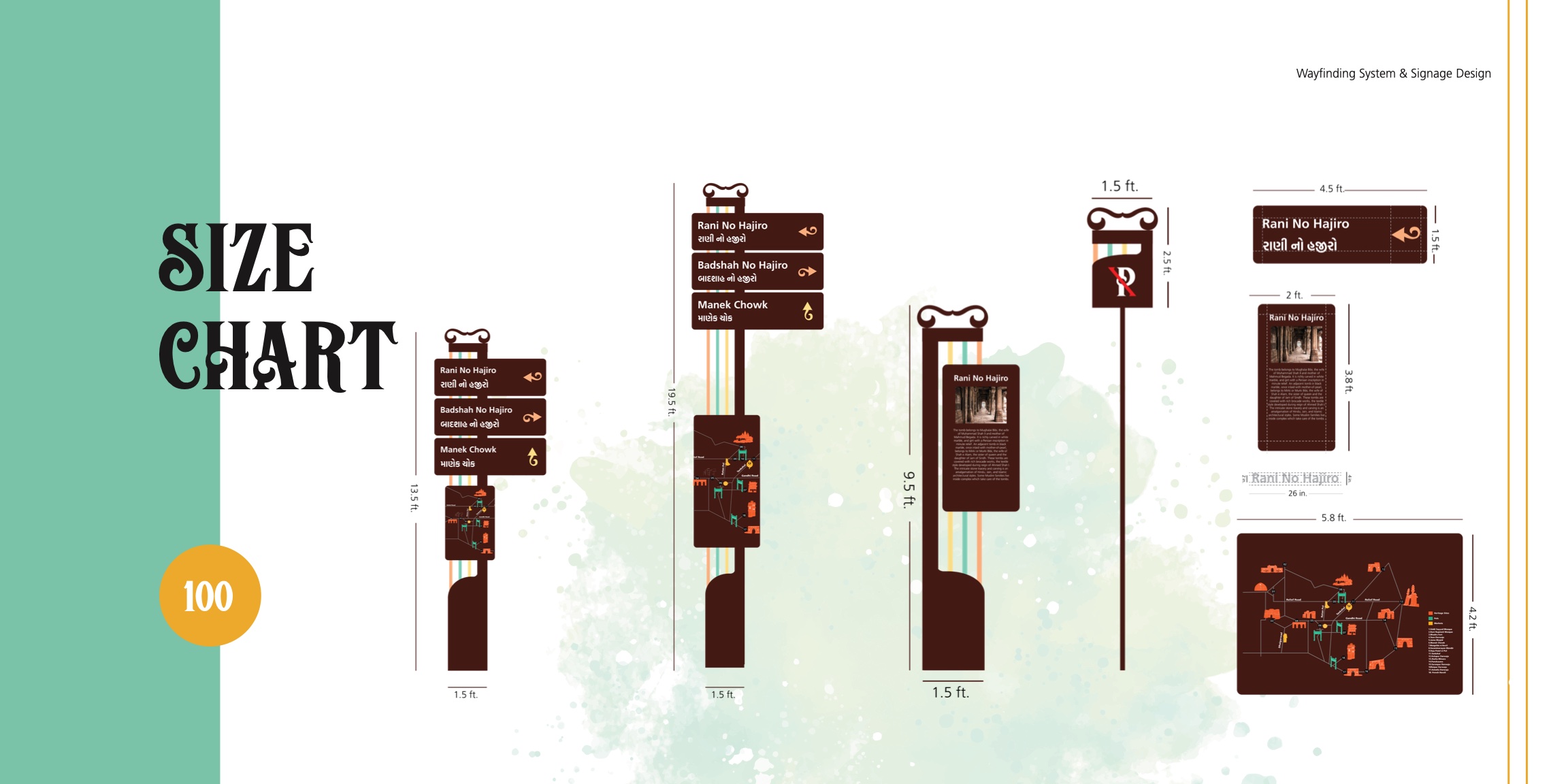
Heritage Clarity — a sign family spanning orientation boards, directional blades, interpretive plaques, and mobility signage with documented sizes, content grammar, and in-situ placement logic.
2)Users, Research & Pain Points
Methods
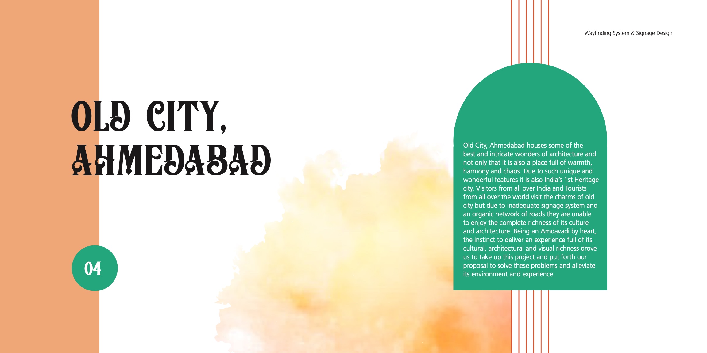
On-ground audits with photo logs and sightline notes, informal interviews with tourists, shop owners, and guards, and path tracing at peak and off-peak hours.
Key findings
- •Visitors miss tucked-away POIs and rely on ad-hoc directions — they need simple maps plus time and distance cues.
- •Drivers enter lanes too deep and need earlier parking diversion signage.
- •Existing boards are tiny, low-contrast, or visually drowned in the streetscape.
Personas & journeys
- •Heritage Tourist (day trip): entry → orient → 4–6 POIs → exit.
- •Local Shopper (parking-first): car → parking → 2–3 stops → return.
3)Concept & Visual Language
Concept
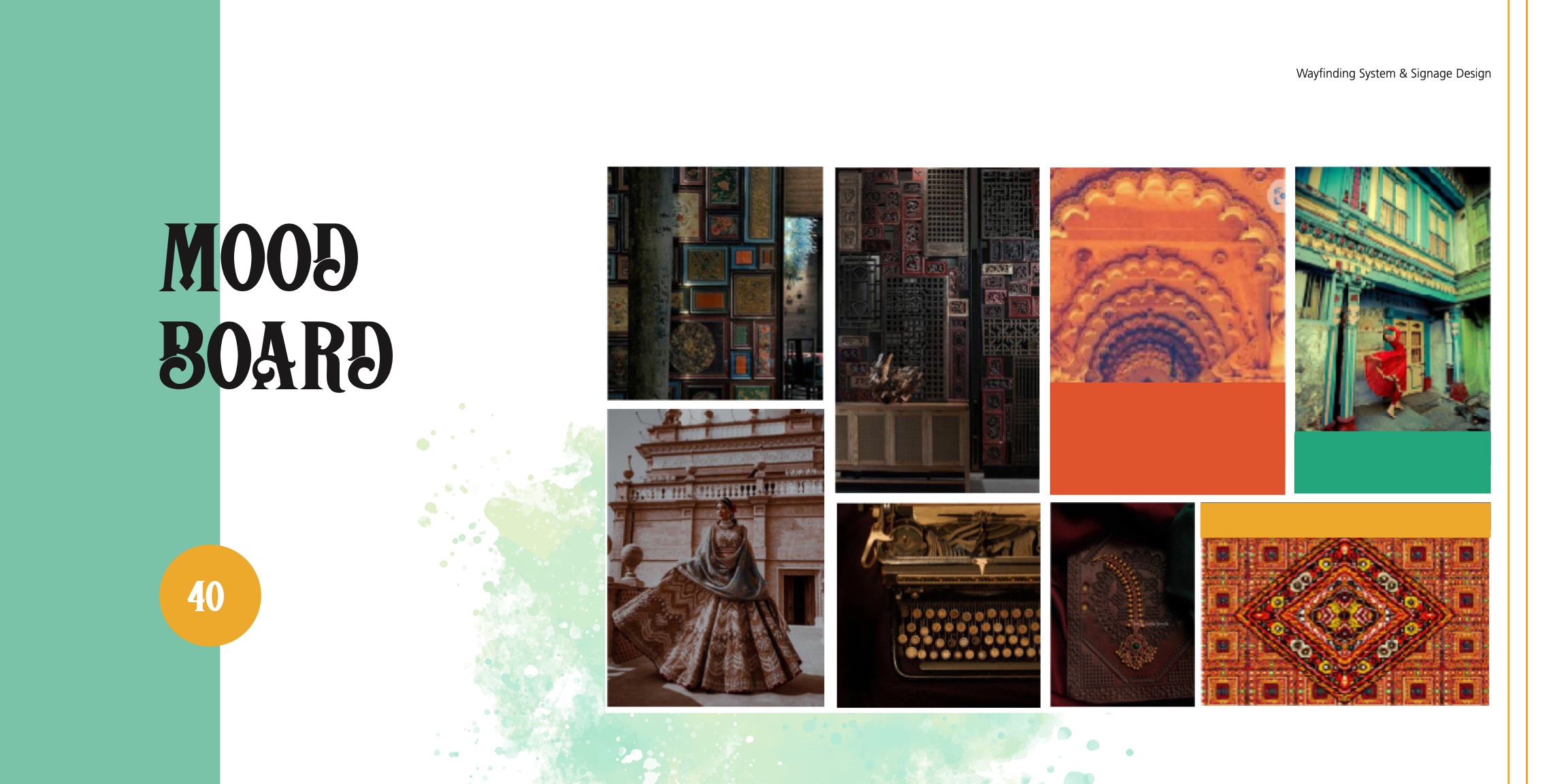
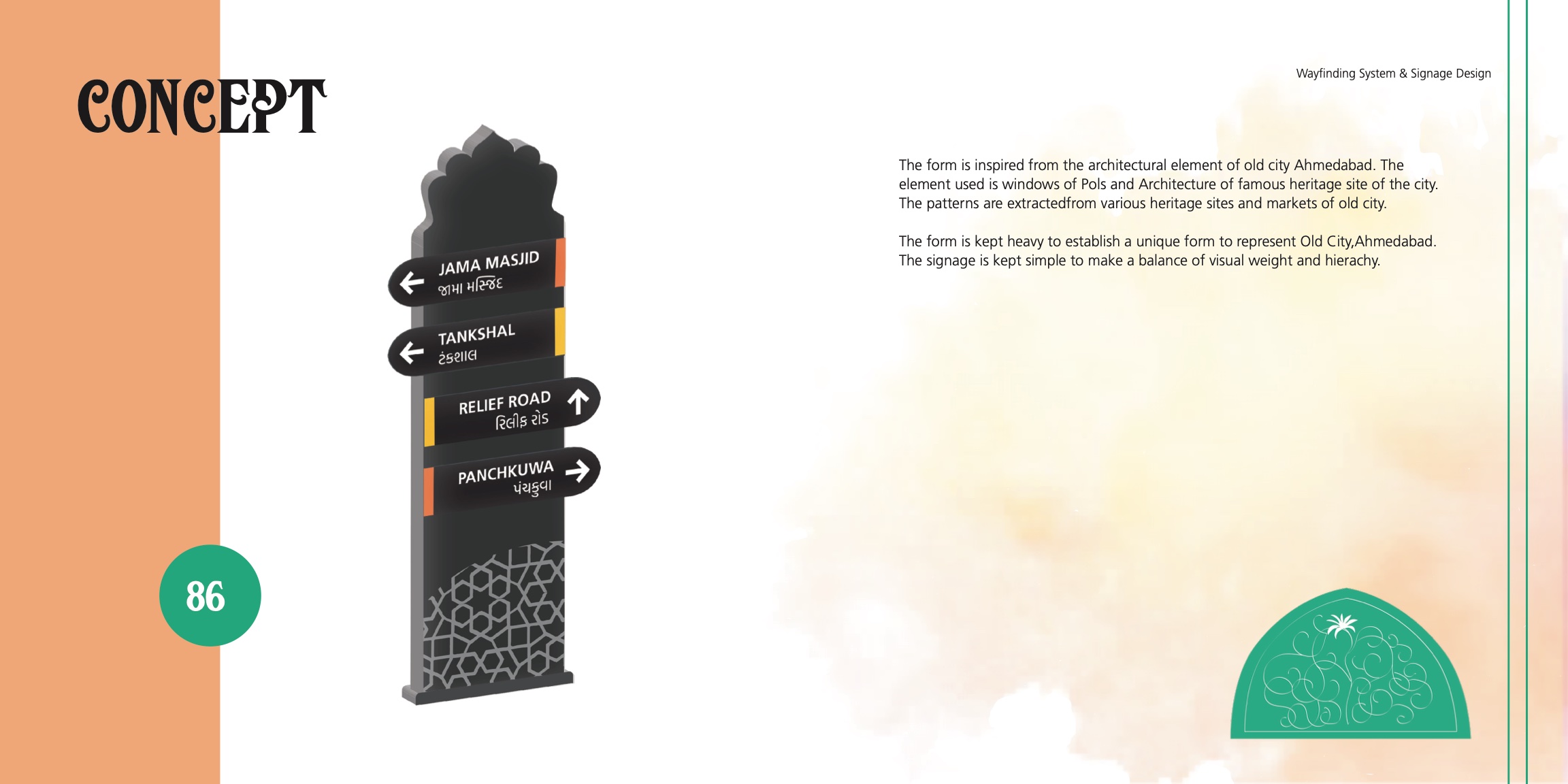
Heritage Clarity — modern legibility wrapped in old-city cues.
Form & style
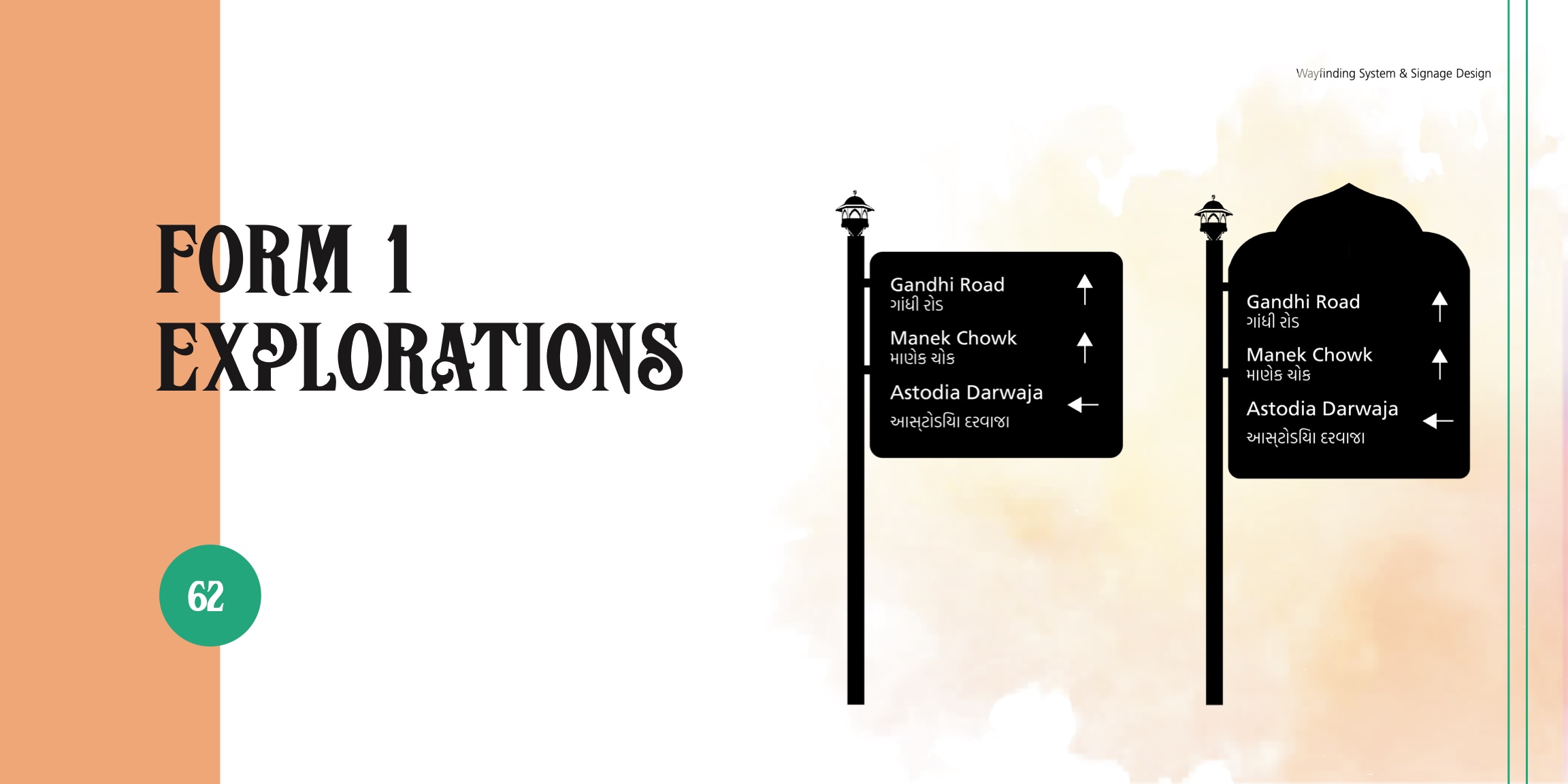
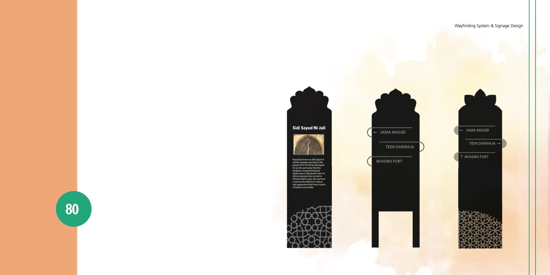
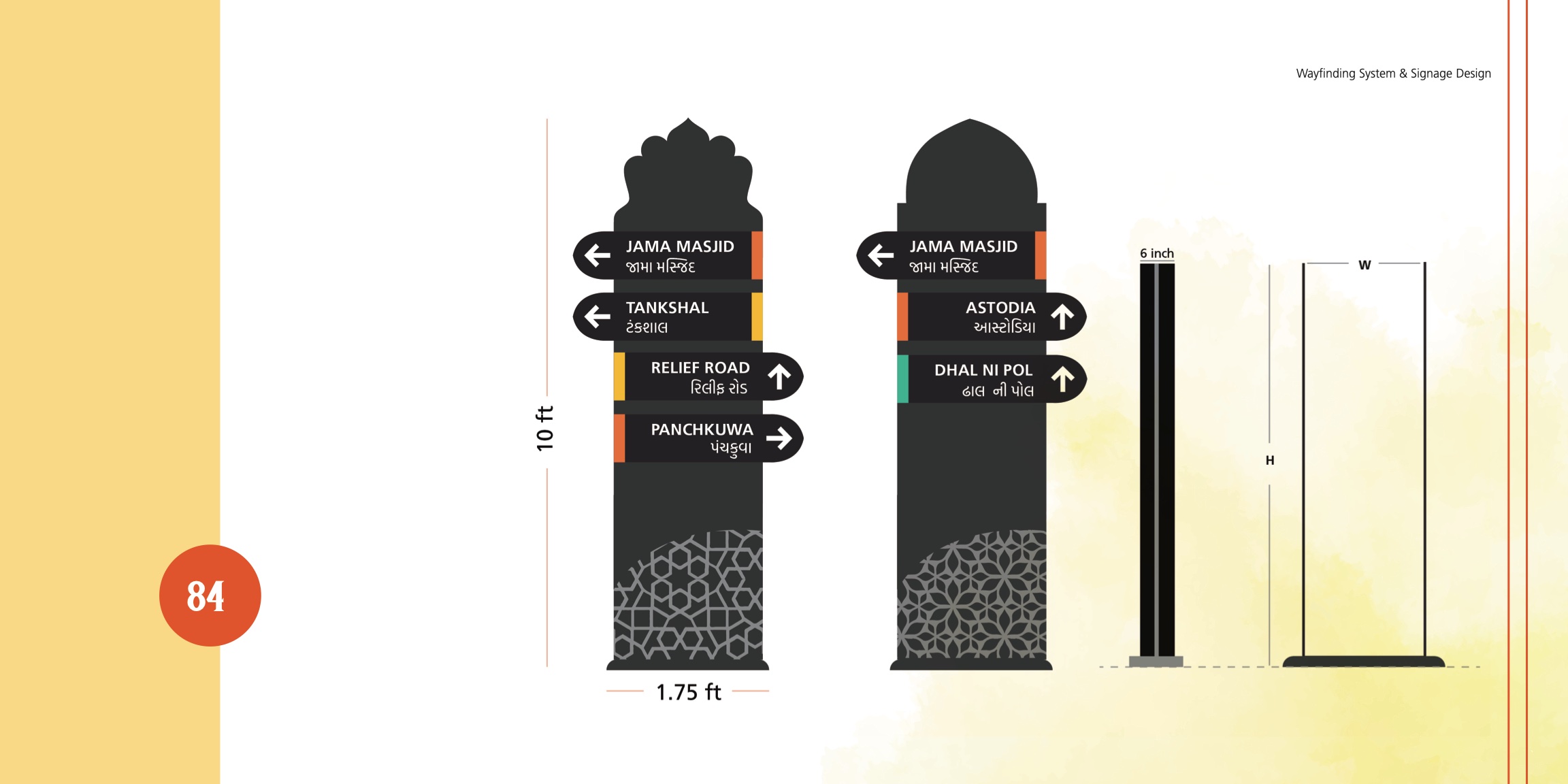
- •Silhouette & trim: arched window top; subtle jaali edge pattern.
- •Typography: heritage-flavored display for headings + high-legibility sans for info; paired EN/GU with balanced hierarchy.
- •Palette: terracotta header band, cream text for contrast, marigold accents for emphasis and POIs.
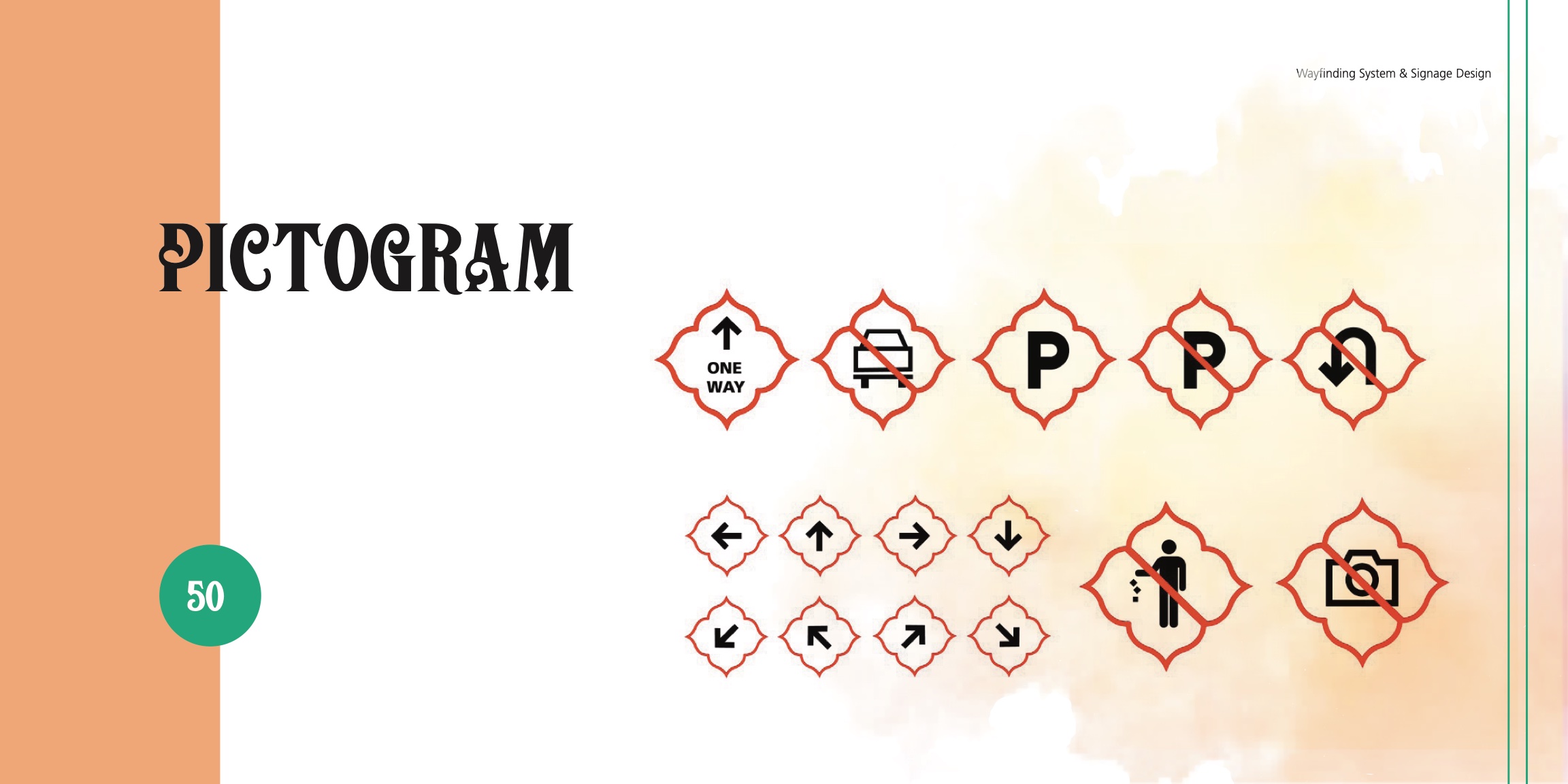
- •Icons: geometric, low-detail pictograms tested for instant recognition.
Result
A system that reads fast but feels native to place.
4)System Architecture
Orientation boards
Gateways and parking — “You Are Here” map with 5–10 POIs, walking times, optional QR for a mobile guide.
Directional blades
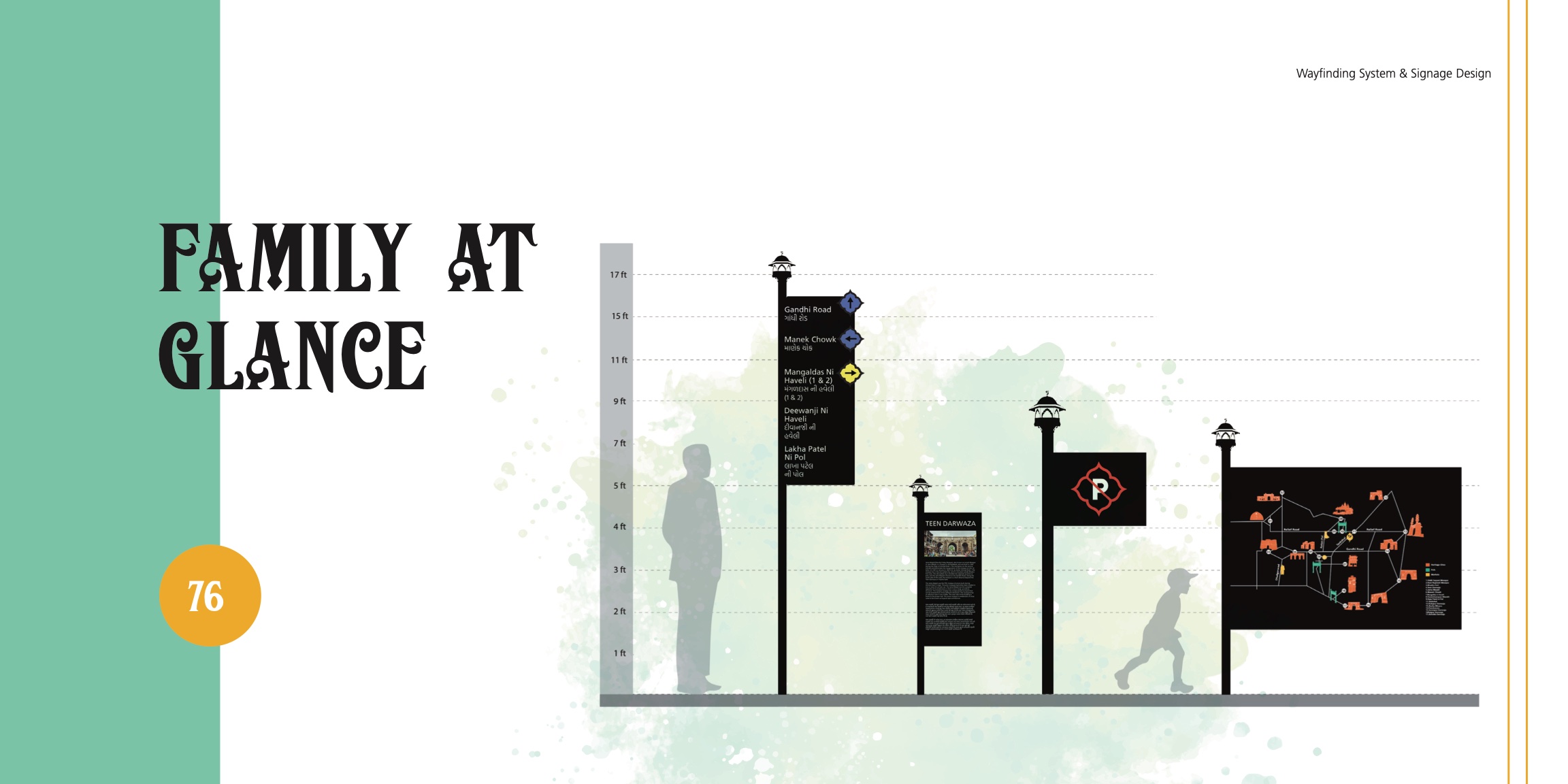
Intersections — destination name, arrow, distance (m), walk time (min), and icon; primary vs. secondary destinations by type scale.
ID & interpretive plaques
At POIs — bilingual name plus 2–3 line story; consistent metadata strip with icon and area.
Mobility & regulatory
Pedestrian zone, auto stand, parking, one-way — friendly microcopy (“Explore on Foot”) over punitive tone.
Rules documented
Fixed header band, EN/GU pairing order, min sizes by viewing distance, arrow orientation validated in situ, contrast targets.
5)Content, Language & Accessibility
Bilingual parity
Gujarati not treated as secondary — equal prominence where native users dominate; mirrored emphasis in English at visitor nodes.
Concise microcopy
Verbs first (Visit, Turn, Walk), no jargon; distances and walk time for mental model.
Accessibility
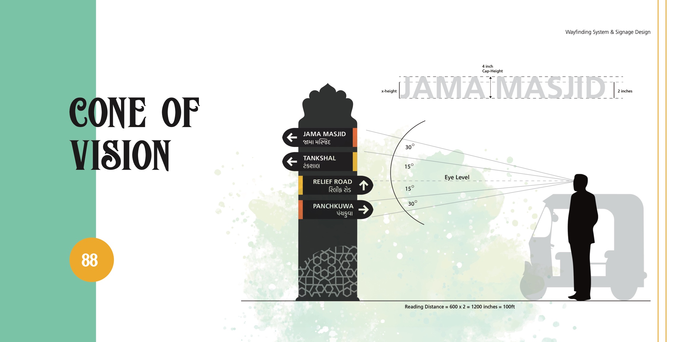
Type sizes by sightline (pedestrian vs. vehicular), color contrast ≥ WCAG, reflective graphics for night legibility; mounting heights clear of street clutter; tactile/braille option at major boards.
6)Materials, Placement & Prototyping
Materials
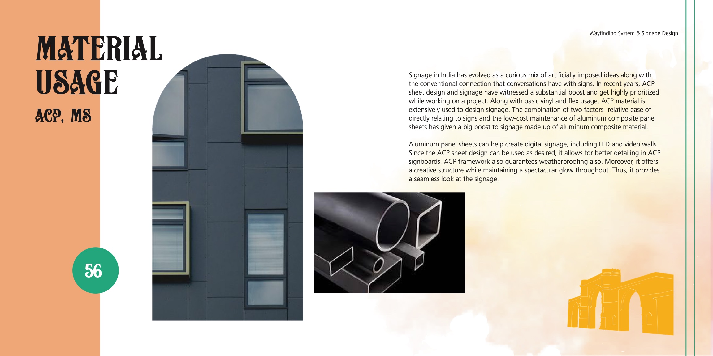
- •ACP (aluminum composite) with powder-coat — weather and stain resistant.
- •Retro-reflective vinyl (traffic-grade) for night glow without power.
- •UV-stable inks; tamper-friendly fixings.
Placement logic
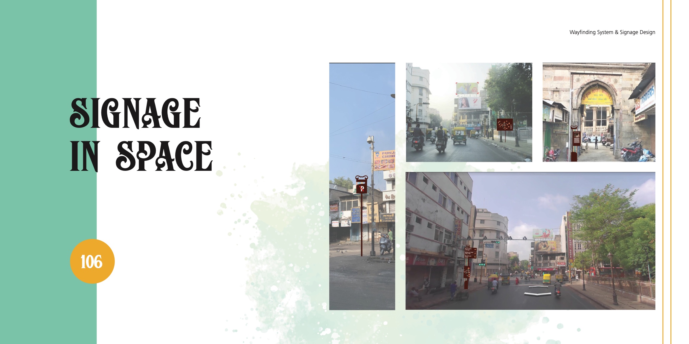
Cones of vision, crowd density, façade setbacks; small/medium/large variants per street width.
Prototyping
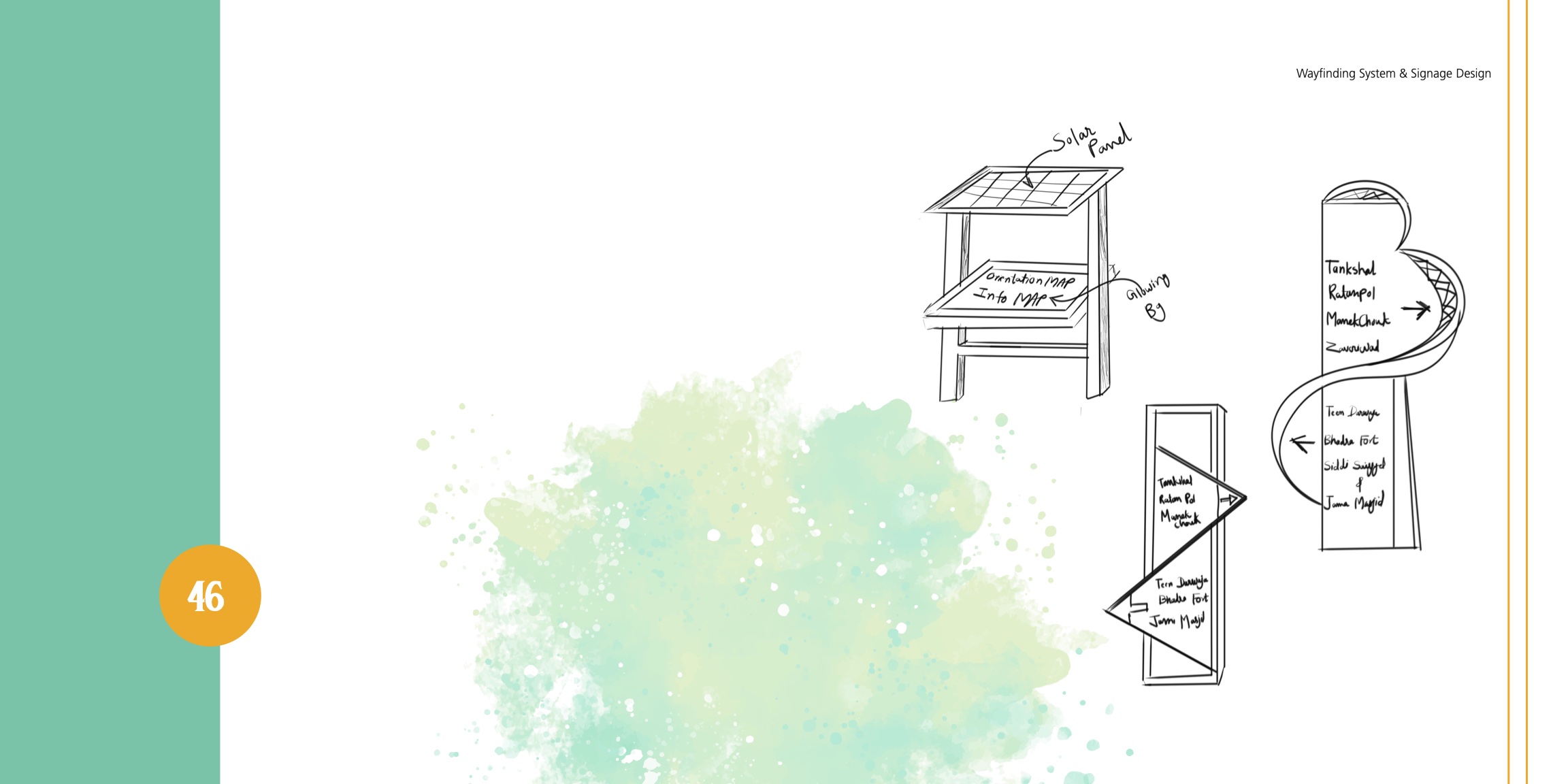
- •Scaled foam/print mock of a directional stack for legibility checks.
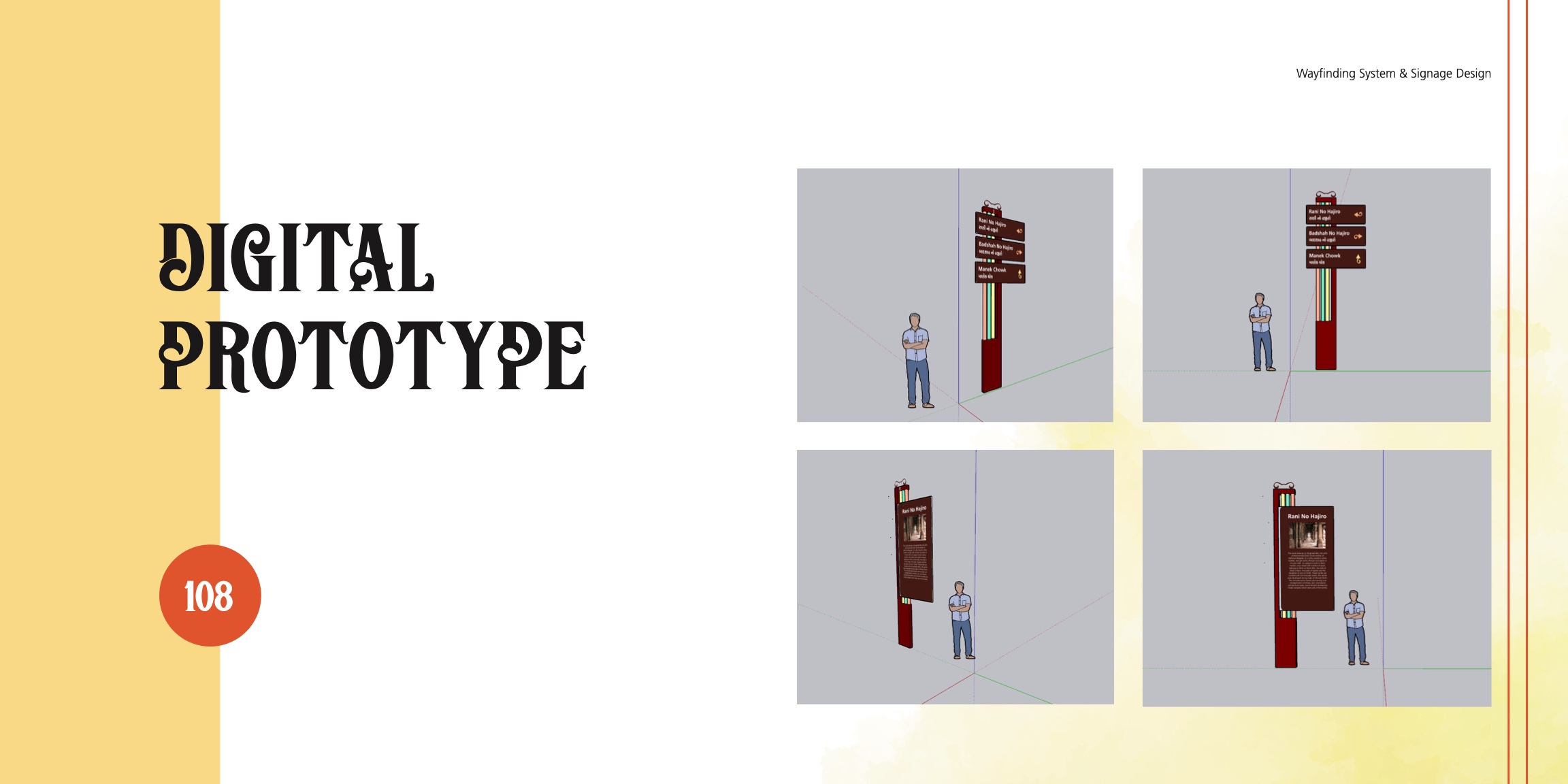
- •Digital prototypes validated scale in context.
- •Material swatches under noon vs. dusk light to lock contrast.
7)Outcomes, Impact & Next Steps
Projected impact
- •Visitors build a quick mental map; fewer lost moments; hidden sites surfaced.
- •Locals benefit from clearer parking and flow, reducing ad-hoc congestion.
- •A consistent urban graphic identity that honors Old City character.
What I learned
Scale-in-context beats on-screen mockups; bilingual pairing needs typographic diplomacy; “invite, don’t police” improves compliance.
Next steps
Gateway kit (orientation + parking), intersection kit (2–3 blades), POI plaque set, fabrication specs; optional QR microsite mirroring icons and colors; tactile plates at high-traffic boards.