NNP 2025 Impact Report
Designed and synthesized New Neighbors Partnership's 2025 Impact Report across digital and print formats, turning program data, family stories, financials, and community outcomes into a warm, accessible, and donor-ready publication.
- Year :
- 2025
- Focus :
- Impact Report · Nonprofit Communication · Data Storytelling
- Role :
- Design, Content Synthesis, Layout Design, Data Visualization, Image Placement
- Project Duration :
- 2025
1)Brief & Objectives
Client / Organization
New Neighbors Partnership
Deliverables
Annual Impact Report / Nonprofit Communication Material
Tools
Canva, Figma, Google Docs, Brand System Assets
The ask
New Neighbors Partnership needed a 2025 Impact Report to communicate the organization's yearly impact to donors, volunteers, partner organizations, board members, and community supporters. The report needed to clearly show the scale of NNP's work while keeping the emotional, human-centered nature of the organization — warm, personal, and community-driven rather than overly corporate.
Audience
Donors, volunteers, partner organizations, board members, and community supporters seeking both measurable impact and connection to NNP's mission.
Format
Desktop PDF + Print Booklet Version
Core skills
Editorial design, nonprofit storytelling, impact communication, data visualization, brand consistency
Goals
- •Communicate annual impact with warmth, clarity, and donor-ready professionalism
- •Structure content as a journey from emotional storytelling to measurable outcomes
- •Turn program statistics into visual data blocks that feel human, not corporate
- •Produce both desktop PDF and print booklet versions from one design system
- •Apply NNP's visual identity consistently across photography, quotes, and charts
Outcome snapshot
A donor-ready annual impact report that communicates NNP's 2025 community impact through clear data, warm storytelling, thoughtful photography, and a consistent visual identity across both digital and print formats.
2)Project Context & Purpose
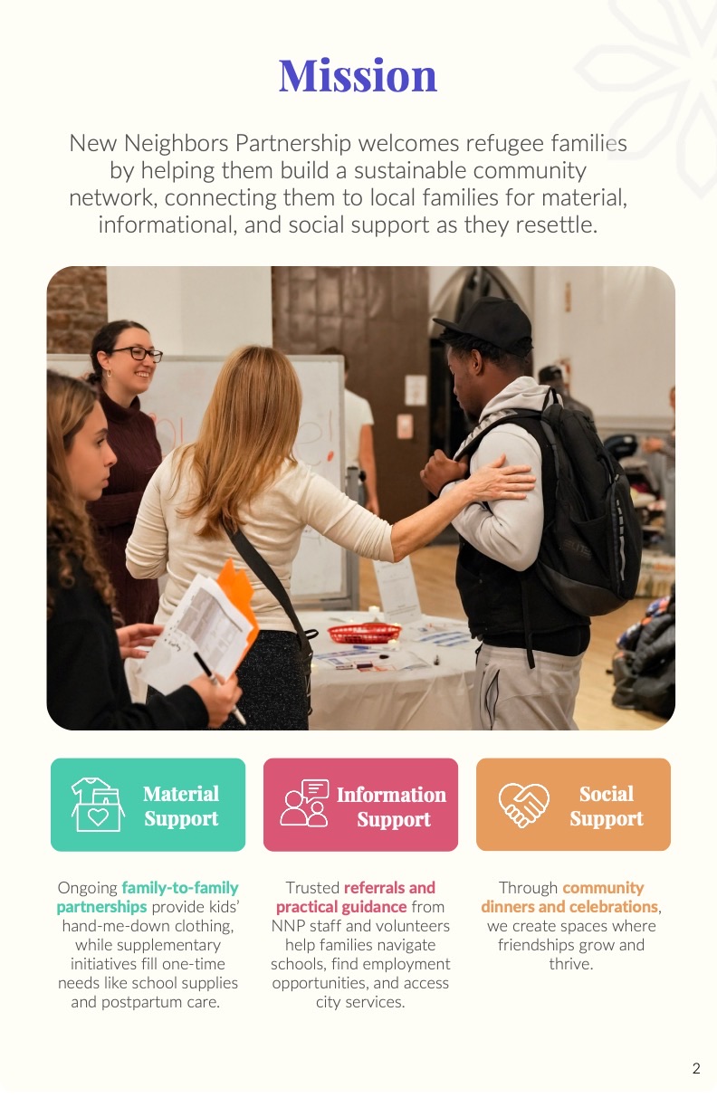
The report highlights NNP's work across clothing partnerships, school supplies, postpartum support, Ramadan care packages, emergency food support, information referrals, community dinners, welcome events, financials, partners, staff, and special thanks.
3)My Role & Contribution
My role included both design and content synthesis. I helped organize the report content into a clear structure, designed the full visual layout, placed images, created data blocks, and adapted the report into two formats: one for desktop PDF viewing and one for printed booklet copies.
Contributions
- •Synthesizing written content into a clear report flow
- •Designing the full impact report layout
- •Creating desktop PDF and print booklet versions
- •Organizing program statistics into visual data blocks
- •Placing photographs to support storytelling
- •Applying NNP's visual identity consistently
- •Designing quote callouts, icons, charts, and section layouts
- •Balancing donor-facing professionalism with warmth and humanity
4)Audience, Structure & Story Flow
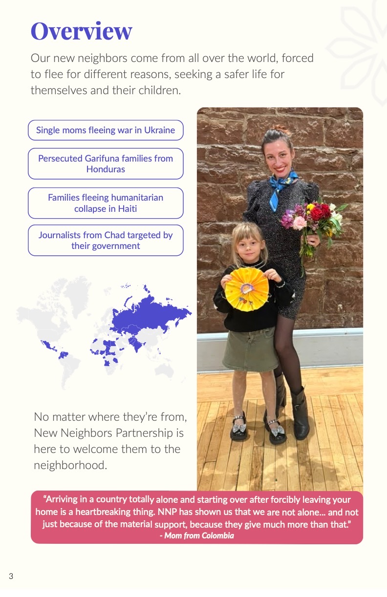
The content was structured as a journey. It begins with an executive letter and mission overview, then moves into family stories, program impact, data, financial transparency, partner recognition, and community gratitude.
Report flow
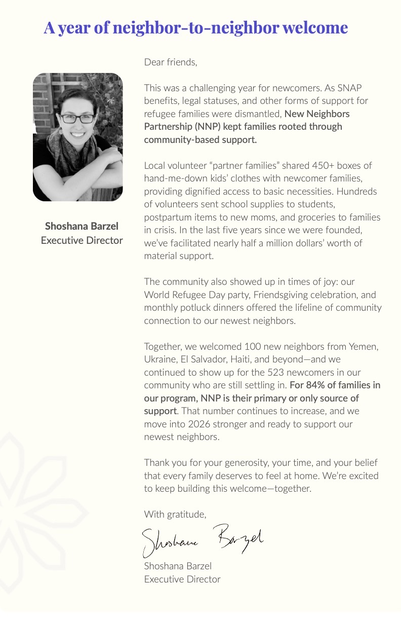
- •Opening letter from the Executive Director
- •Mission and support model
- •Overview of newcomer communities served
- •Family story: Meet Mirian
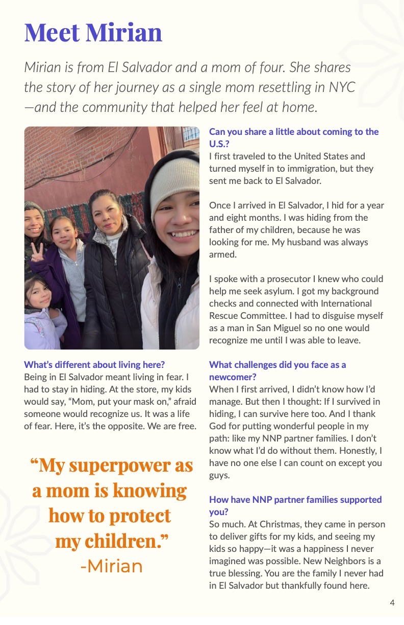
- •Clothing Partnership Program
- •Ramadan, school supplies, postpartum, and emergency food support
- •Information support and referrals
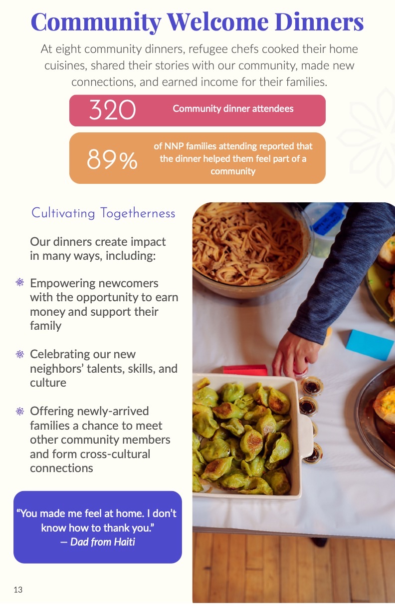
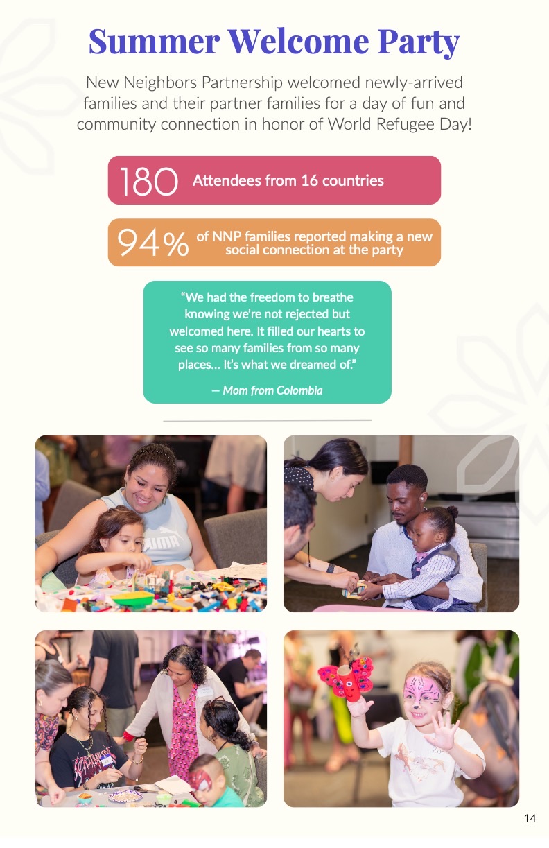
- •Community welcome dinners and Summer Welcome Party
- •Financials, partners, staff, board, and special thanks
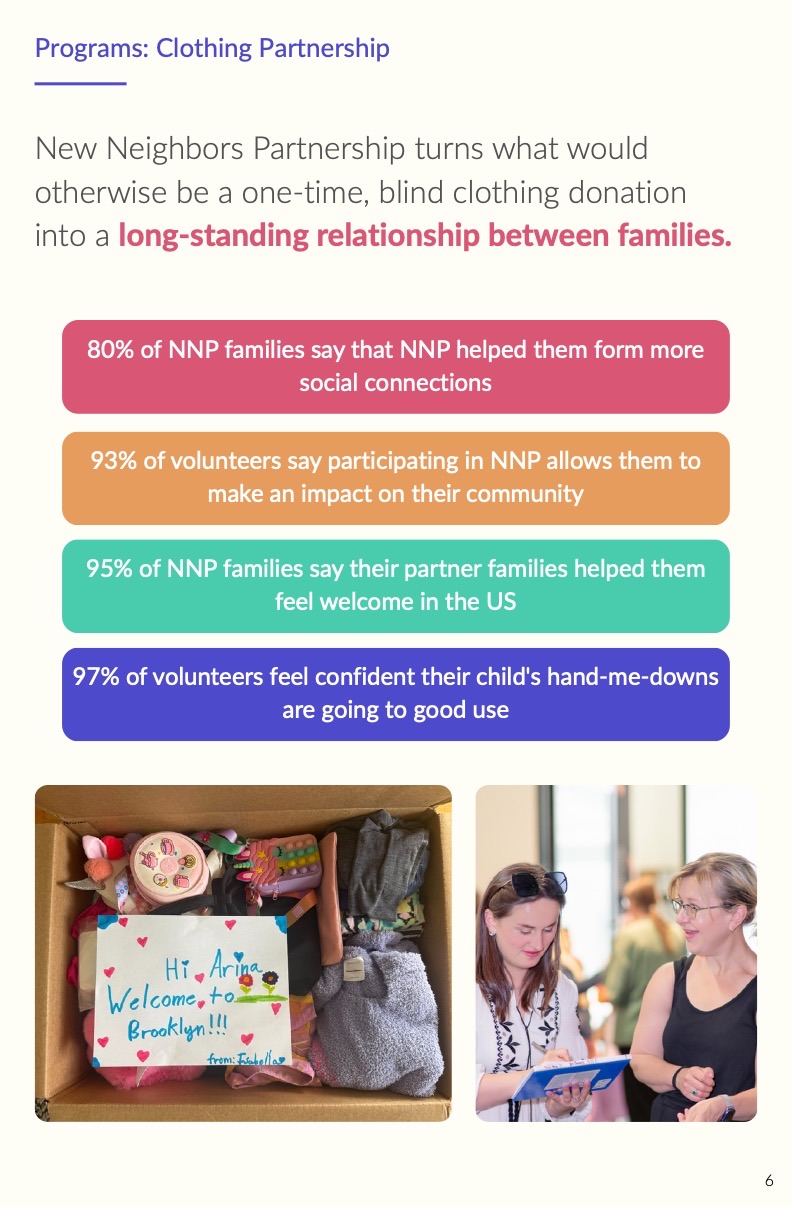
5)Visual Direction & Brand System
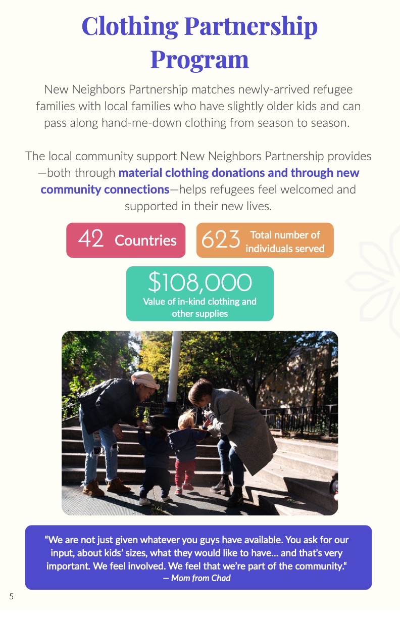
The visual direction followed NNP's warm, welcoming, and community-centered brand identity. The design needed to feel professional for donors and funders, but also personal enough to reflect NNP's relationship-based work.
Key visual choices
- •Large editorial headings for clear section breaks
- •Soft cream backgrounds for warmth and readability
- •Purple as the main brand color for recognition
- •Teal, orange, pink, and blue blocks for program statistics
- •Rounded photo frames for a softer visual tone
- •Quote callouts to highlight family voices
- •Icons to explain program areas and benefits
- •Donut charts for financial transparency
- •Map visualization to show staff diversity and lived experience
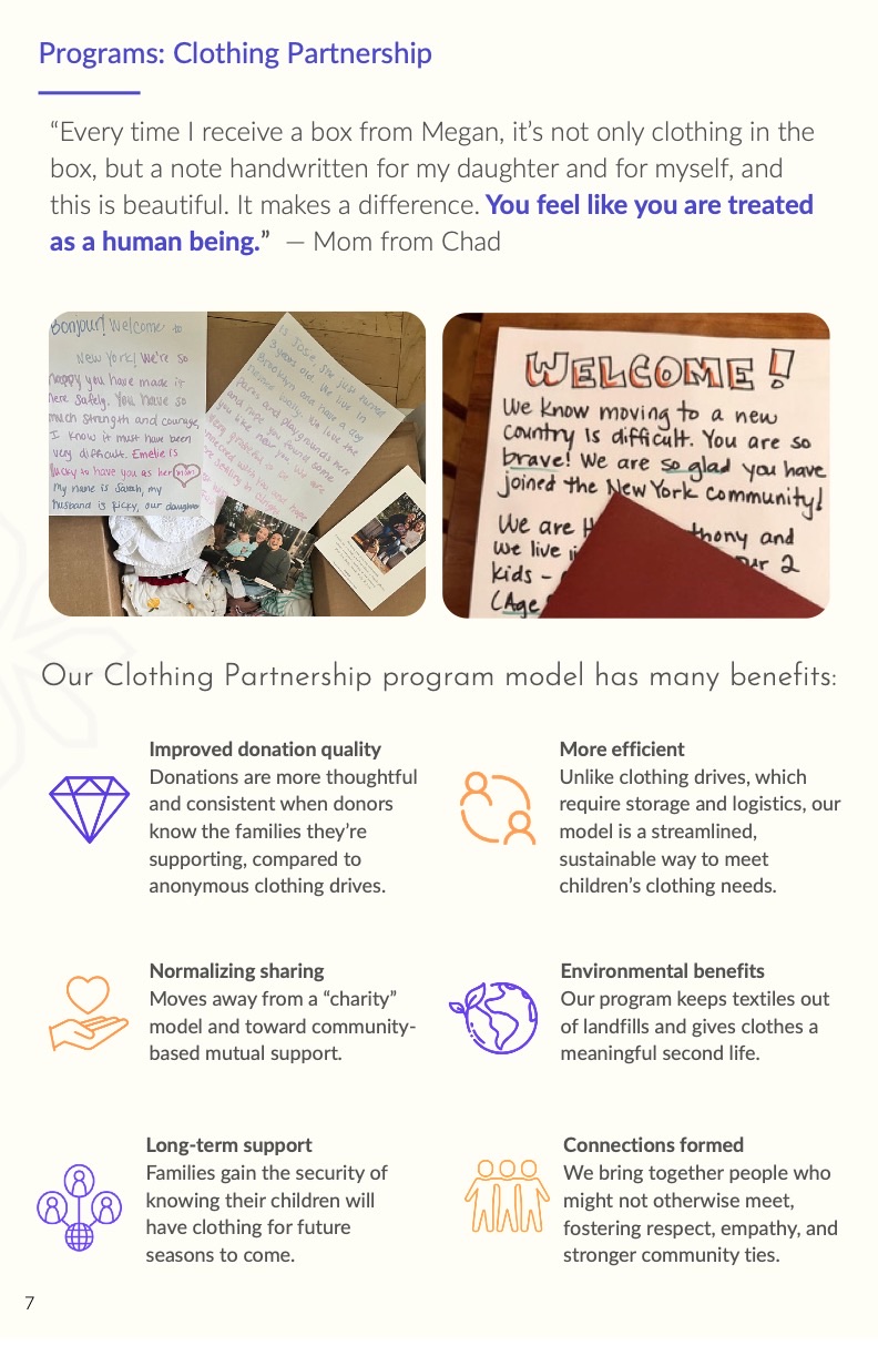
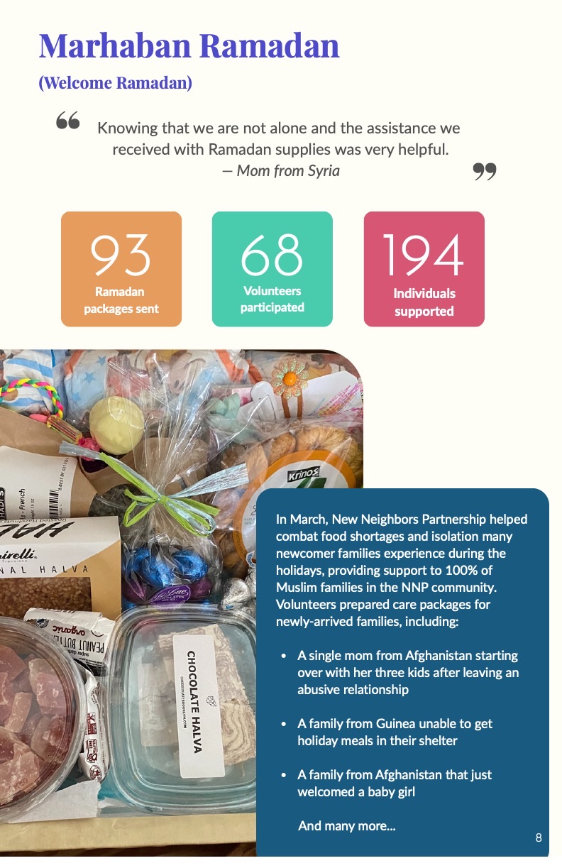
6)Data Visualization & Information Design
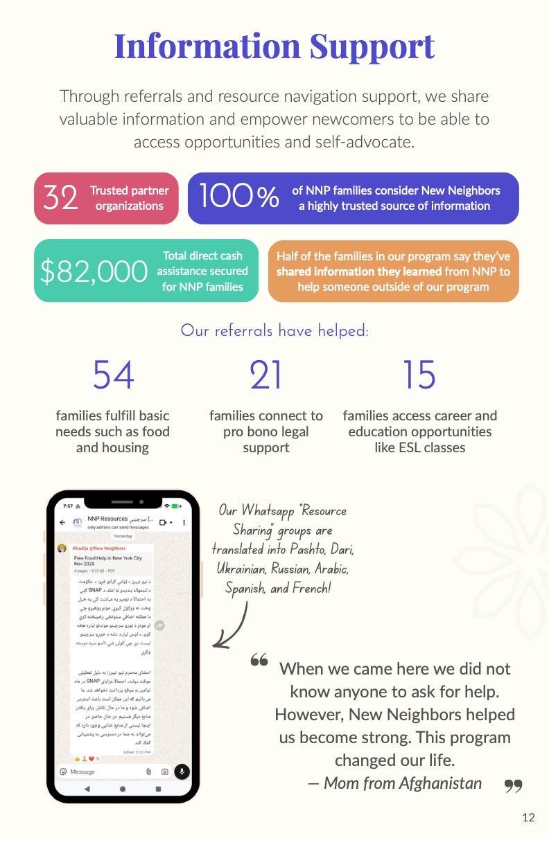
A major part of this project was turning program data into information that felt clear, readable, and meaningful. Instead of presenting all statistics as plain text, I used colorful data blocks, charts, grouped layouts, and strong hierarchy to help readers understand the impact quickly.
Key outcomes highlighted
- •623 individuals served through the Clothing Partnership Program
- •$108,000 value of in-kind clothing and supplies
- •176 children receiving school supply packages
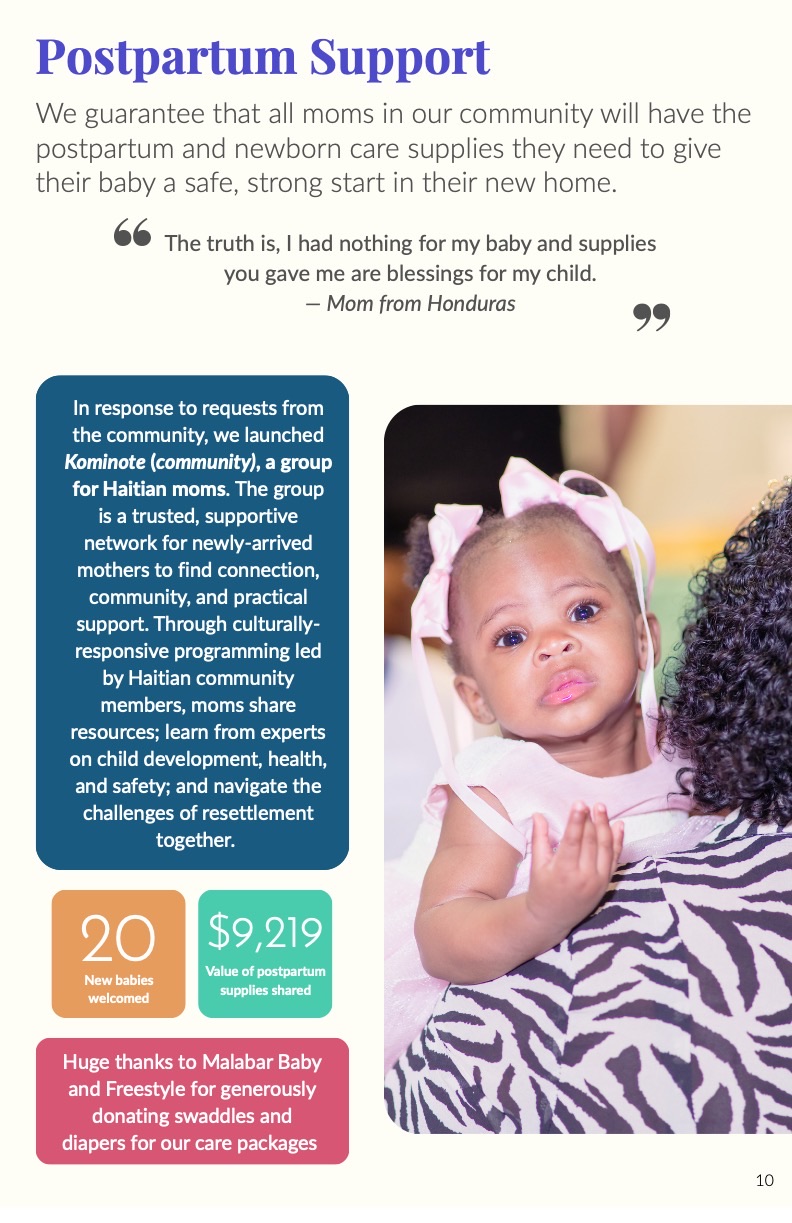
- •20 new babies welcomed through postpartum support
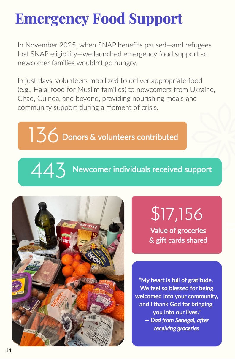
- •443 newcomer individuals supported through emergency food assistance
- •$82,000 in direct cash assistance secured for NNP families
- •320 community dinner attendees
- •180 Summer Welcome Party attendees from 16 countries
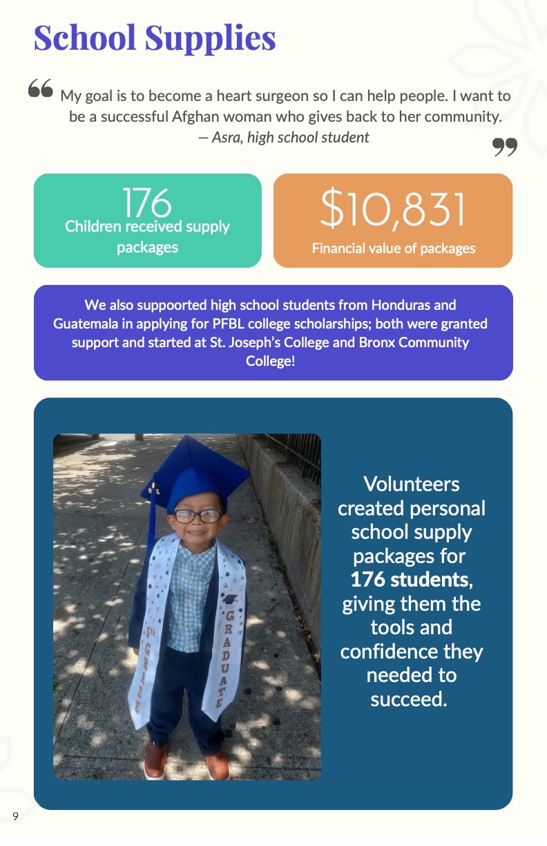
7)Storytelling, Photography & Emotional Tone
The report uses photography, quotes, and family stories to keep the content human-centered. The "Meet Mirian" page adds a personal narrative, while program pages use photographs of clothing packages, handwritten notes, groceries, school supplies, babies, dinners, and community events to show the real outcomes of NNP's work.
Emotional tone
The tone is hopeful, grateful, and grounded. It acknowledges that 2025 was a difficult year for newcomers, while showing how the NNP community continued to provide care, dignity, and practical support. Family quotes serve as emotional anchors — feeling welcomed, supported, human, and part of a community.
8)Outcome & Reflection
The final outcome was a complete 2025 Impact Report designed in two formats: a desktop PDF for digital sharing and a booklet version for printed copies. The report successfully brought together NNP's annual data, program updates, family stories, donor recognition, financial information, and community gratitude into one cohesive publication.
Reflection
This project strengthened my ability to design nonprofit communication materials that combine editorial design, content strategy, data visualization, and storytelling. It reflects my ability to synthesize large amounts of information and turn it into a clear, visually consistent, and emotionally meaningful report.