NNP Brand Style Guide
Designed and synthesized a 5-page brand style guide for New Neighbors Partnership to create a consistent visual system across digital, print, social media, and partner-facing communication materials.
- Year :
- 2025
- Focus :
- Brand System · Visual Identity · Nonprofit Design
- Role :
- Visual Design, Content Synthesis, Brand System Organization, Layout Design, Image & Asset Placement
- Project Duration :
- 2025
1)Brief & Objectives
Client / Organization
New Neighbors Partnership
Deliverables
Brand Style Guide / Nonprofit Visual Identity System
Tools
Canva, Google Docs, NNP Brand Assets
The ask
New Neighbors Partnership needed a simple and practical brand style guide that could help the organization maintain visual consistency across its communication materials. Since NNP creates a wide range of assets — social media posts, referral guides, handbooks, brochures, donor materials, and event graphics — the goal was to make the brand easier to use and apply across different formats.
Audience
NNP team members, communications volunteers, designers, interns, and anyone creating visual content for the organization.
Format
5-page digital brand guide
Core skills
Brand identity, color system, typography, social media design, visual consistency, nonprofit communication
Goals
- •Create a clear reference for colors, typography, social media templates, and content categories
- •Turn NNP's warm, community-centered identity into an organized visual system
- •Make brand decisions easier for both designers and non-designers
- •Define practical color-coding for social media and communication types
- •Support long-term consistency across print, digital, and partner materials
Outcome snapshot
A practical nonprofit brand style guide that helped New Neighbors Partnership maintain a consistent, warm, and recognizable visual identity across social media, print materials, partner resources, and community-facing communication.
2)Project Context & Purpose
The guide was created to give the team a clear reference for colors, typography, social media templates, and content categories. It helped turn NNP's warm, community-centered identity into a more organized visual system.
3)My Role & Contribution
My role included both design and content synthesis. I helped organize the brand information into a clear structure, designed the layout of the guide, placed visuals and brand assets, and made the content easy to understand for future use.
Contributions
- •Synthesizing brand rules into a clear style guide format
- •Designing the full digital guide layout
- •Organizing the color palette and usage system
- •Structuring typography guidance for headings and body text
- •Placing visual examples and template references
- •Creating a practical guide for social media and communication use
- •Making the brand system easier for internal team members to apply consistently
4)Audience & Communication Goal
The main goal was to make brand decisions easier and more consistent. Instead of creating a complex brand manual, the guide focused on practical usability.
Practical focus
It explains which colors to use for different types of content, what fonts define the brand voice, and how social media templates should be categorized — useful for both designers and non-designers.
5)Color System & Brand Usage
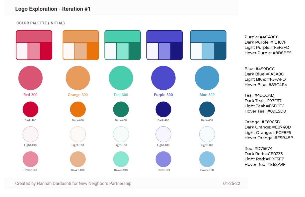
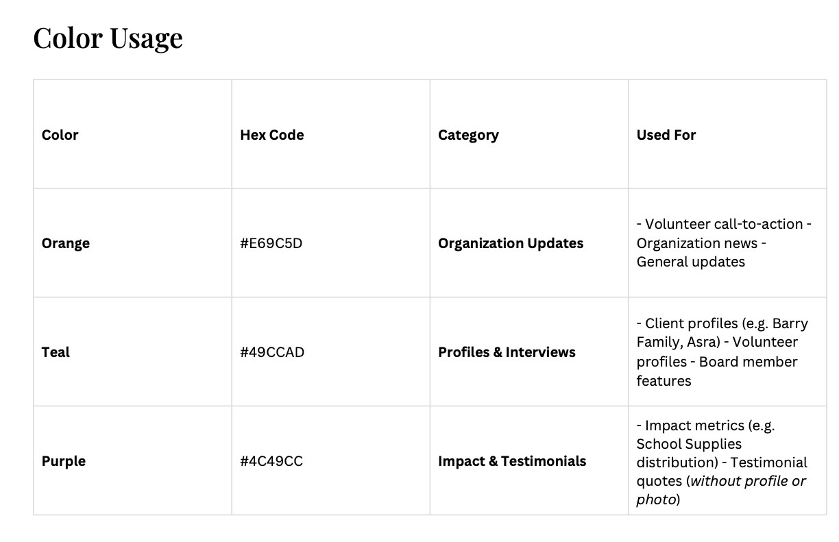
The palette includes purple, blue, teal, orange, and red, along with darker, lighter, and hover variations for each color. These colors help NNP feel warm, welcoming, organized, and community-oriented.
Color-coding by content type
- •Orange: Organization updates, volunteer calls-to-action, news, and general updates
- •Teal: Profiles, interviews, client stories, volunteer features, and board member highlights
- •Purple: Impact metrics, testimonial quotes, school supply updates, and outcome-focused posts
6)Typography & Visual Identity
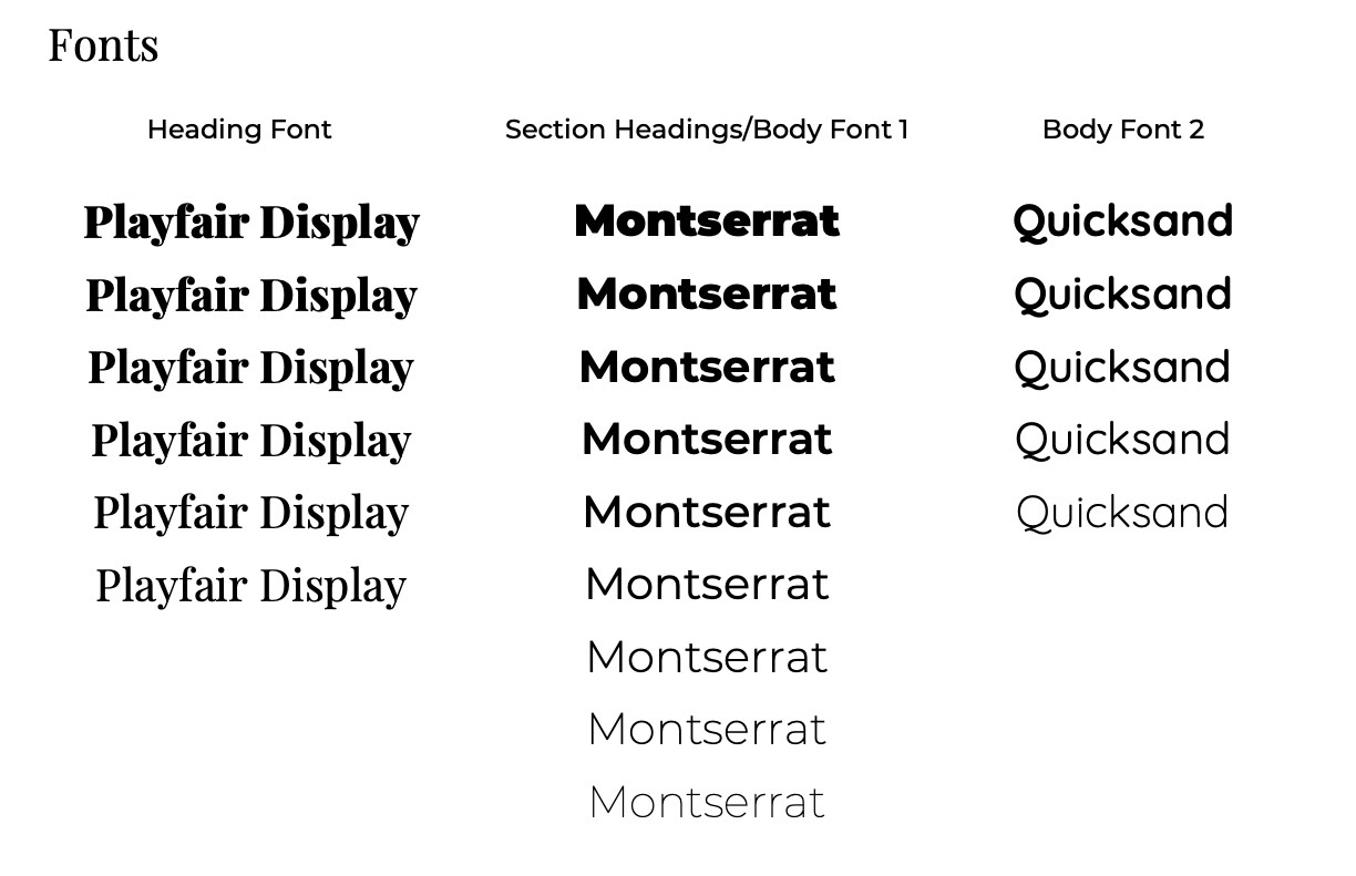
Type system
- •Playfair Display — warmth, elegance, and a human-centered tone for headings
- •Montserrat — clean, professional structure for body text and section headings
- •Quicksand — softness and approachability for lighter communication moments
Together, the font system helped balance professionalism with the emotional warmth needed for a nonprofit working with families, volunteers, and community partners.
7)Social Media Templates & Content Categories
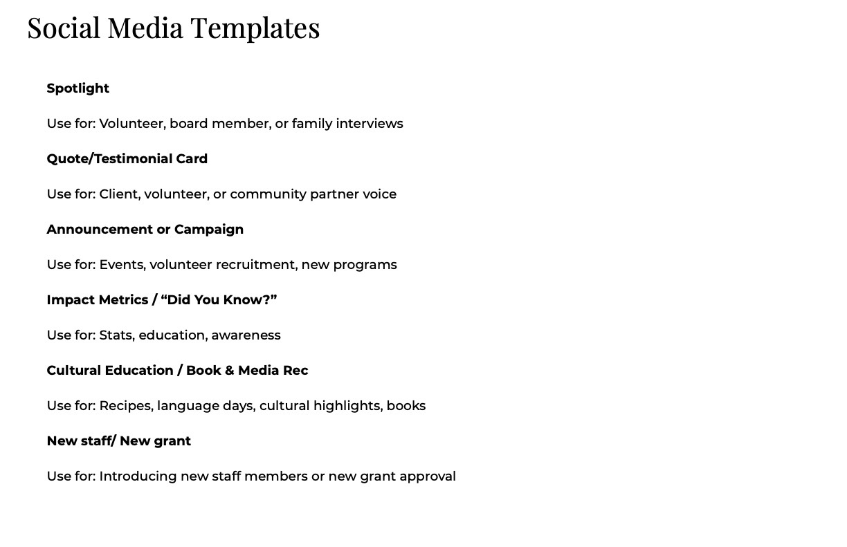
The guide includes a social media template system organized by purpose so the team could quickly understand which format to use for which type of post.
Template categories
- •Spotlight posts for volunteer, board member, or family interviews
- •Quote and testimonial cards for community voices
- •Announcement and campaign posts for events and recruitment
- •Impact metrics and "Did You Know?" posts for statistics and awareness
- •Cultural education and book/media recommendation posts
- •New staff and grant announcement posts
8)Outcome & Reflection
The final outcome was a clear and practical 5-page brand style guide that helped NNP organize its visual identity and apply it more consistently across different materials. It gave the organization a shared design language for colors, typography, social media, and communication assets.
Reflection
This project strengthened my ability to build brand systems that are not only visually appealing but also usable for real teams. It reflects my ability to synthesize brand content, organize design rules, place visuals thoughtfully, and create documentation that supports long-term consistency.