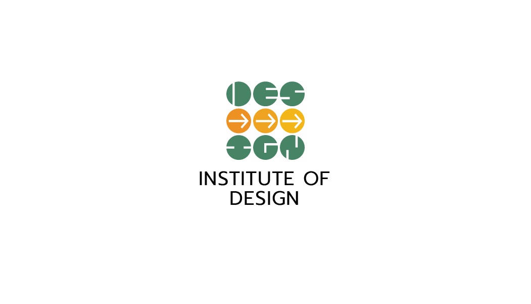
Institute of Design — DODNU Brand Identity
A refreshed identity for Nirma University's Institute of Design (DODNU) — a distinctive, modular brand system expressing a young, collaborative design culture across print, space, and digital.
- Year :
- 2021
- Course :
- Identity Design (Academic)
- Role :
- Concept co-lead; logo construction; typography & color system; icon/pattern libraries; stationery; signage; merch; brand guidelines authoring
- Project Duration :
- Semester project
1)Brief & Objectives
Team
5 students (academic project)
The ask
Nirma University — Institute of Design (DODNU) needed a refreshed identity to express a young, collaborative design culture and to clearly differentiate the department on campus and in the wider community. Established in 2017, the department had an eclectic visual presence with low consistency across print, space, and digital. Create a distinctive, modular brand system with rules and ready-to-use assets so staff and students can deploy it correctly, fast.
Audience
Prospective students, faculty, campus visitors, and stakeholders who wanted the brand to feel playful and inventive while remaining credible within a university ecosystem.
Goals
- •A recognisable symbol with a memorable idea — not just style
- •A scalable grammar that works from favicon to façade
- •Easy-to-apply templates for stationery, web/social, and wayfinding
- •Clear do/don't rules to prevent drift and misuse
Outcome snapshot
A cohesive brand guideline and asset library covering mark, color, type, iconography, patterns, sub-brands, templates, and usage rules for print, space, and digital.
2)Research, Problem & Objectives
What we audited
- •Legacy mark had multiple colorways and ad-hoc lockups; typography mixed styles; patterns were decorative rather than systematic
- •Print, space, and digital were designed in silos — no shared tokens (type, spacing, color roles)
Design objectives
- •Coherence: one underlying geometry to tie everything together
- •Legibility: second-read personality that doesn't sacrifice clarity
- •Extensibility: sub-brands for Communication Design, Industrial Design, and Foundation
- •Usability: rules that a non-designer can follow
- •Accessibility: color contrast and typographic rhythm suitable for long reads and signage
3)Concept & Design Language
Big idea: Progress, together


A 3×3 grid of circles cuts the word DESIGN into the negative space. The middle row houses three right-facing arrows — momentum, guidance, optimism. The device is abstract at first glance and rewarding on second read.
Core elements

- •Mark & lockups: vertical (stacked) and horizontal; built on a circular grid

- •Color roles: calm greens/teals (trust), vibrant marigolds/yellows (energy), plum/magenta and slate neutrals




- •Type system: Prompt (logotype), Roboto (heads/subheads), ITC Franklin Gothic Std (body)
- •Iconography: every pictogram lives inside a circle, with filled and outline variants


- •Patterns: micro dot lattices and bold modular tiles built from circle-cuts
4)System Architecture & Specifications
Construction & spacing

Clear space uses one circle unit around the mark. Minimum sizes set for print/web to protect legibility. Lockups cannot be stretched, re-composed, or placed on busy imagery.
Sub-brands & governance

- •Communication Design, Industrial Design, Foundation inherit the master mark — only internal tile colors vary
- •Palette is closed; only tints/tones of approved hues permitted
- •Typography: left-align, no justification, hyphenation off, classic type scale
- •Do/don't essentials: don't isolate letter pieces; don't apply photo fills inside the mark; don't place over complex photos
5)Applications & Touchpoints
Business & environmental

- •Visiting cards, letterheads, envelopes, forms, certificates — standardized information hierarchy

- •Studio/workshop plaques; interior directional signs; campus banners and façade signage
- •Wall and floor graphics using the pattern library
Digital, merch & templates
- •Website skins with circular image masks; program pages inherit sub-brand accents
- •Apparel, totes, mugs, badges, keychains, portfolio bags, caps, aprons
- •Editable masters for cards, posters, event banners, social posts, web heroes, and signage panels
6)Process, Testing & Implementation
Exploration & systemization

- •Started with the constraint "one geometry only" — circle cuts that read as DESIGN at multiple scales
- •Quick print tests at 16–24 mm and 2–3 m to check counter shapes and arrow clarity
- •Converted recurring decisions into tokens: color roles, spacing units, type scale, icon grid, pattern tiles
Pilot builds & handoff
- •Stress-tested letterhead density, outdoor banners, and low-res social avatars
- •Delivered structured asset kit: master logos, sub-brands, SVG icons, pattern tiles, InDesign/Illustrator/Canva templates
- •Added a one-page Quick Start for non-designers and a troubleshooting page
7)Outcome, Impact & Learnings
Why it works
- •Single primitive → infinite family: circles power the logo, icons, patterns, and image masks
- •Rules with reasons: each prohibition tied to readability or recognition
- •Scalable delight: the second-read "DESIGN" moment rewards curiosity; arrows signal forward motion
Personal learnings
- •Design the system (tokens + rules), not just the symbol
- •Test legibility at the smallest and largest sizes early
- •Accessibility shapes color, type, and contrast decisions from day one
- •Adoption improves when non-designers get named templates and a 1-page cheat-sheet