Clouds and Waves — Book Cover
A lyrical, contemporary cover that translates Tagore’s gentle meditation on childhood wonder into a minimal, symbolic visual—inviting young readers and parents to step into a world where clouds and waves become playmates.
- Year :
- 2022
- Course :
- Illustration Design (Academic)
- Role :
- Solo project — research, concept, illustration, layout, production
- Project Duration :
- 3 weeks
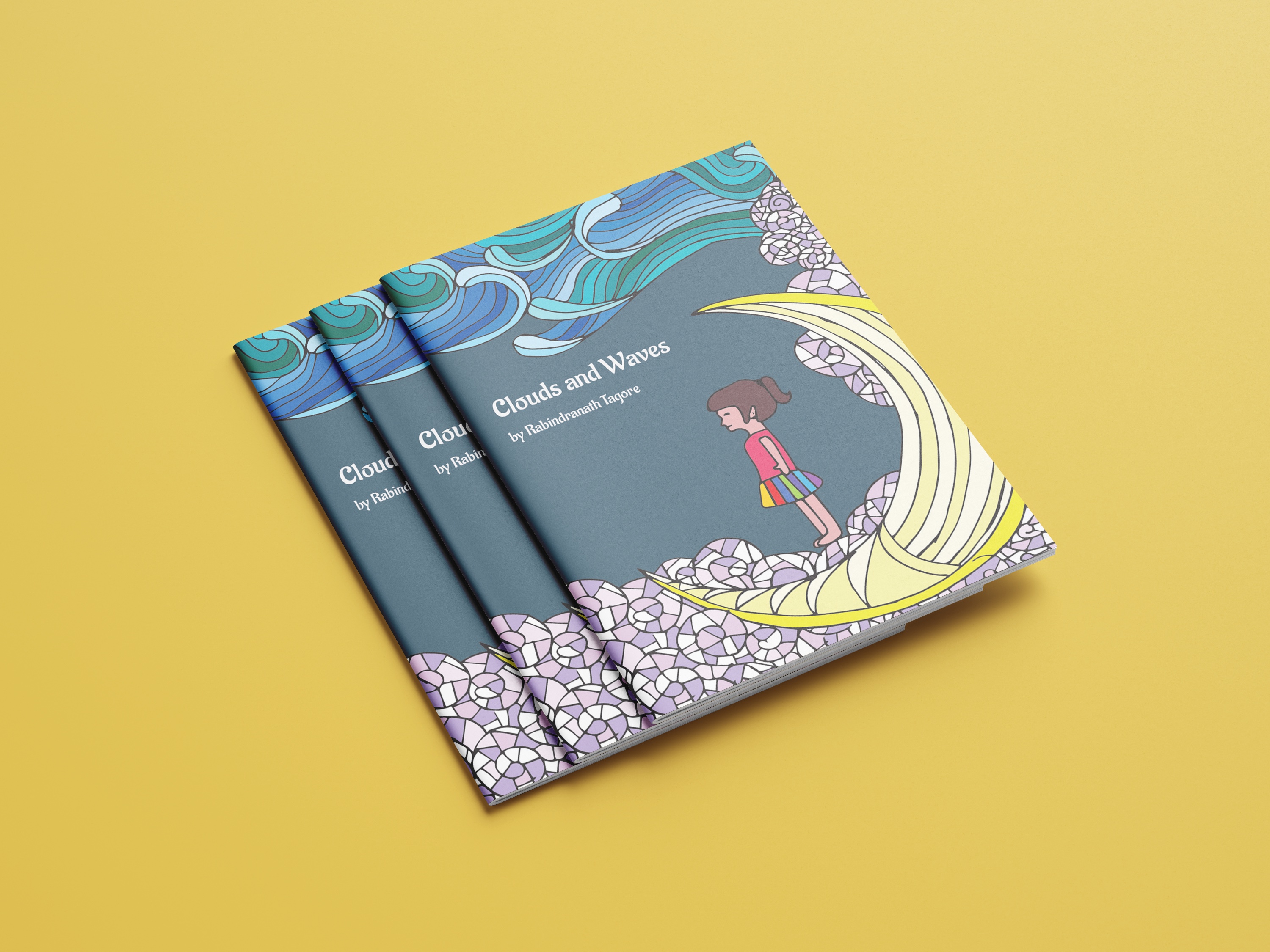
1)Brief & Objectives
Deliverables
Front cover (print), spine & back (spec’d), web thumbnail + mockups
Tools
Procreate/Photoshop for illustration, Illustrator/InDesign for layout, Acrobat for print proofing
The ask
Create the final cover for a children’s/YA edition of Rabindranath Tagore’s poem Clouds and Waves. The cover should feel poetic, warm, and timeless, hinting at the poem’s themes—imagination, nature, and the tender child-mother bond—while remaining readable and marketable on both shelf and screen.
Audience
Young readers and parents; educators and booksellers scanning thumbnails and library catalogues.
Goals
- •Signal the poetic genre at a glance and appeal to young readers and parents.
- •Build a clear hierarchy (title → author → edition/series) that works at thumbnail sizes.
- •Deliver press-ready artwork with clean type, robust contrast, and controlled ink limits.
Outcome snapshot
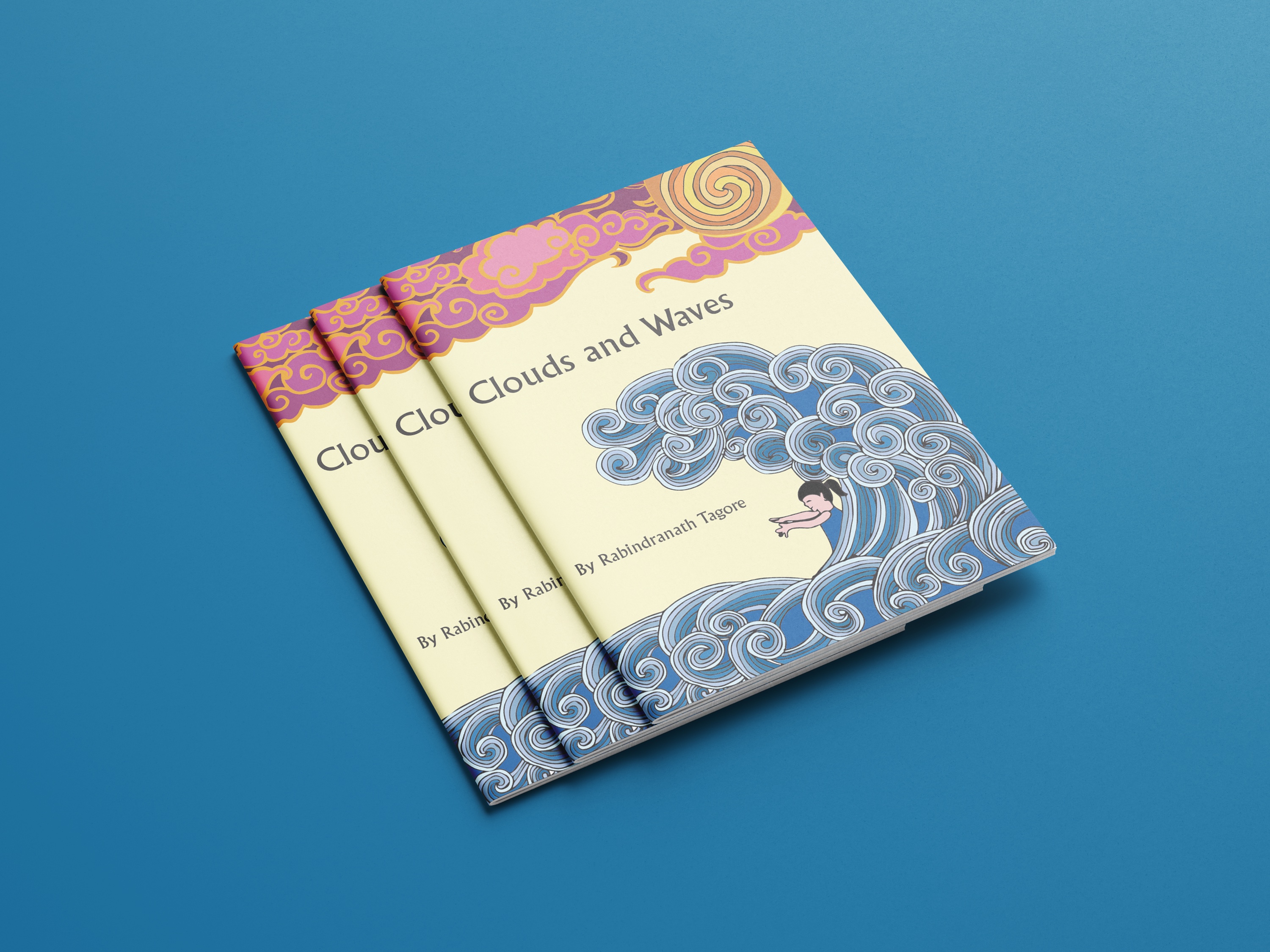
A metaphor-first cover system that reads instantly at small sizes, prints strong, and balances literary credibility with contemporary approachability.
2)Concept & Metaphor
Core idea
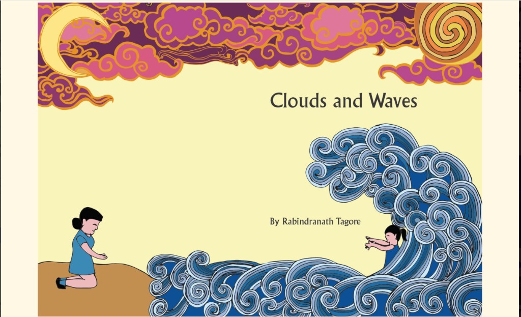
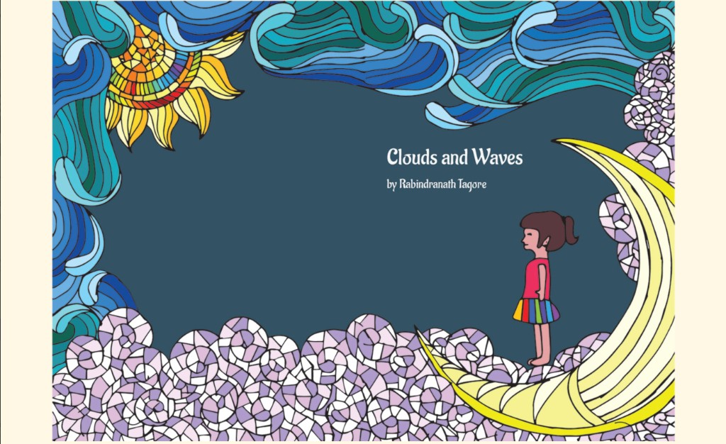
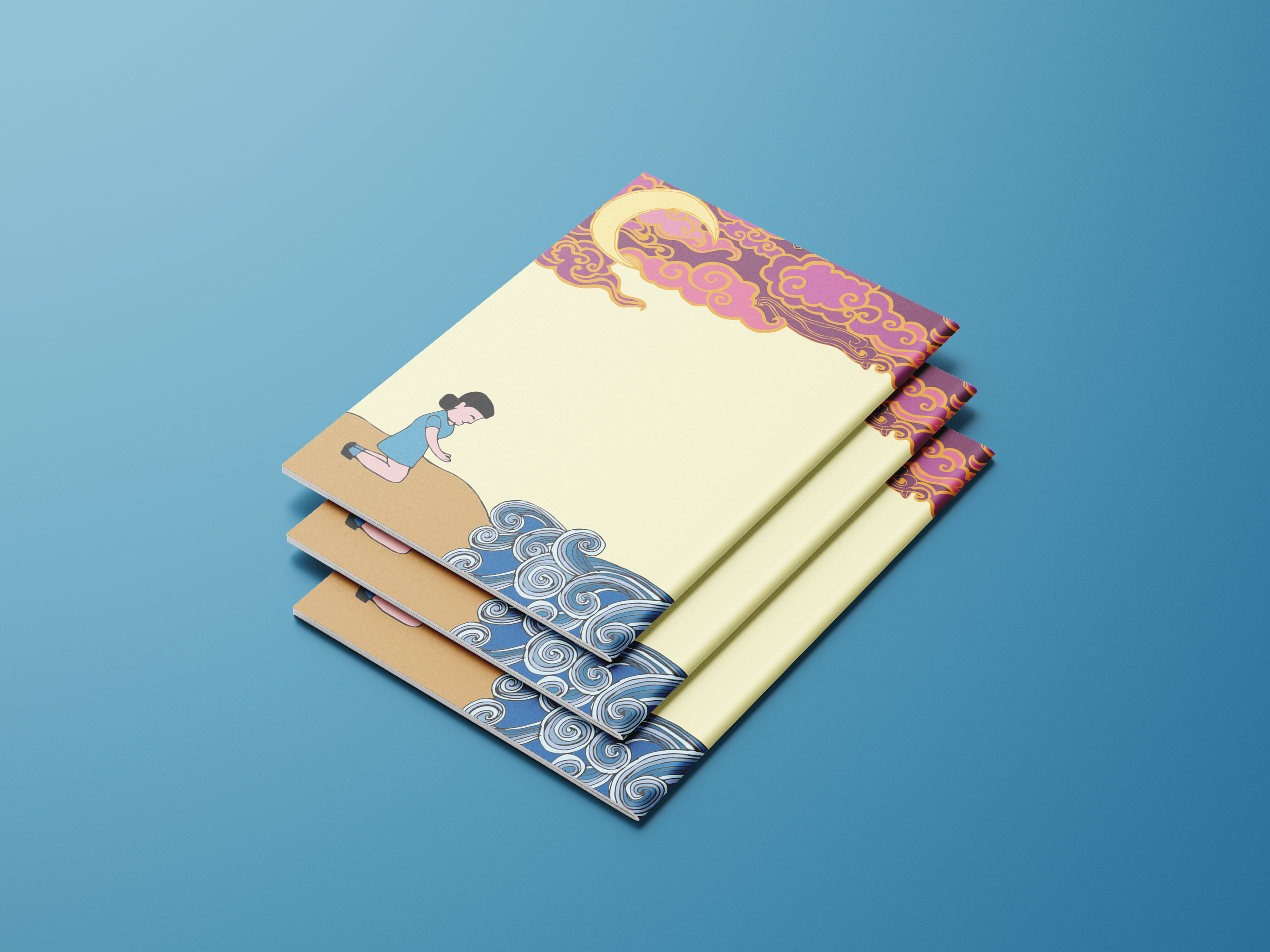
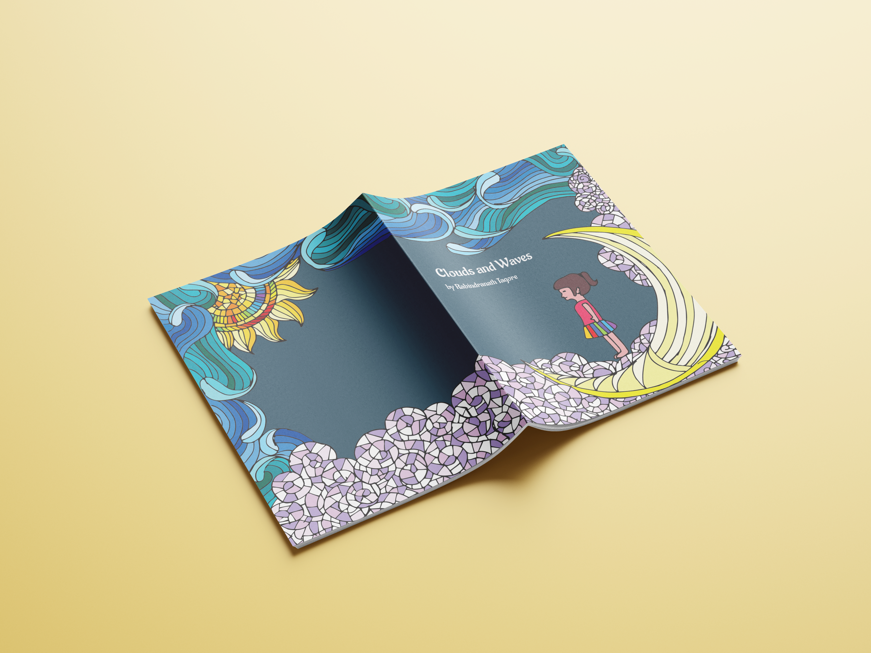
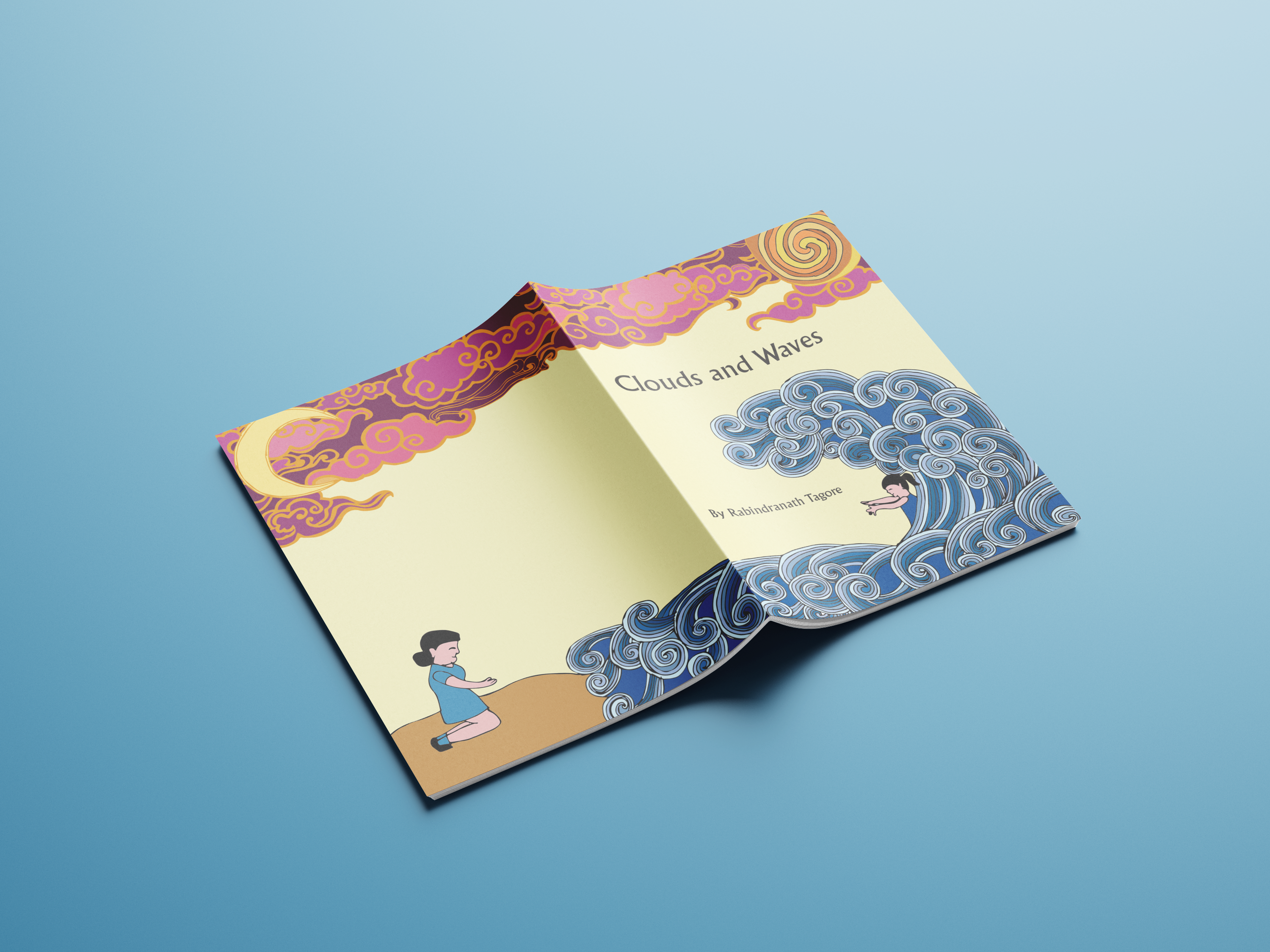
The poem personifies nature as playmates—clouds above, waves below—with the child as a bridge between the two. The cover distills this into a simple, symbolic scene.
Dual realm framing
An airy “sky” zone and a grounded “water” zone form a soft diptych, with the title nestled between—visually echoing the poem’s up/down rhythm.
Child-scale perspective
Visual emphasis and spacing suggest the view from a child’s eye level, reinforcing wonder and intimacy.
Gentle motion cues
Repeating curves and flowing lines suggest swell and drift, without literal waves or clouds dominating the page.
3)Visual Language & Illustration
Illustration style
Clean, editorial-friendly lines with restrained textures to keep type legible. Edges are soft-shaped, avoiding sharp corners so the cover feels safe, inviting, and read-aloud-friendly.
Motifs used with restraint
- •Cloud forms simplified to rounded, airy clusters (no storm cues).
- •Wave forms suggested through layered arcs/contours rather than figurative foam.
- •Starglow/gleam accents (subtle dots/speckles) add magic without clutter.
Scalability
Details remain crisp at print size and survive reduction to small thumbnails for e-commerce.
4)Typography, Color & Hierarchy
Type pairing
- •Classic serif for the title (Garamond/Bembo/Georgia class) — literary heritage with open counters for print clarity.
- •Quiet sans for author and metadata (Gill Sans/Source Sans/Inter class) — modern tone and legibility.
Hierarchy plan
- •Title — largest, centered or optically centered.
- •Author — smaller, generous tracking.
- •Edition/series mark — micro-type, aligned to a system grid.
Palette
Soft, nature-coded hues (sky/celadon/seafoam/cream) with a single high-contrast ink for title. The range keeps the mood calm and luminous, avoids heavy saturation, and passes accessibility contrast for the title area.
5)Layout System & Production Specs
Grid & margins
Simple single-column with a baseline grid for type, plus optical centering for the title block to harmonize with the curved illustration. Generous head/foot margins let the illustration breathe and avoid crowding the trim.
Spine & back cover
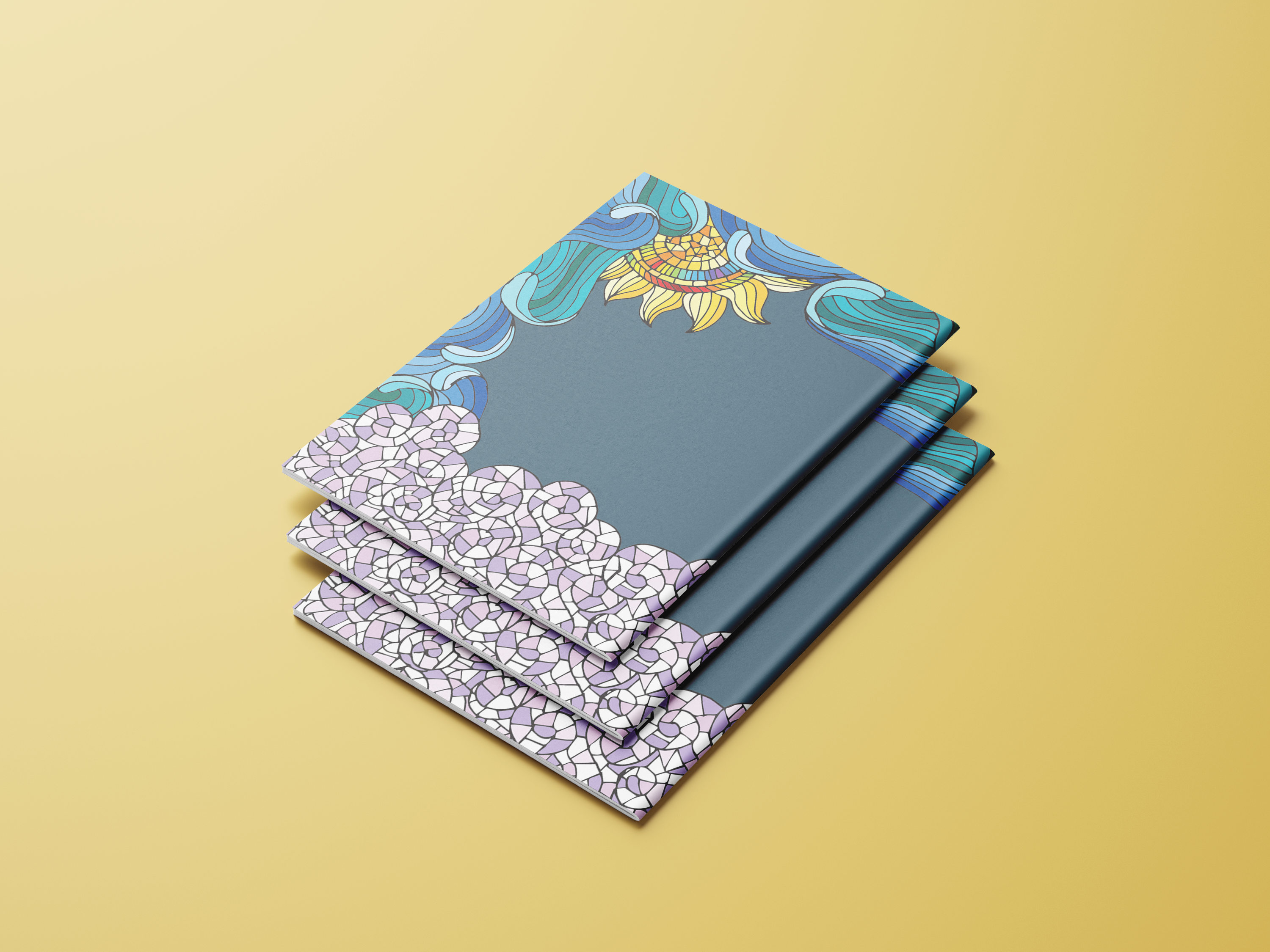
- •Spine: title set rotated with author; series mark at tail.
- •Back cover: short blurb + pull-quote, barcode clear zone, and a miniature motif echo to tie front/back.
Production notes
- •Final artwork delivered CMYK (coated), total ink ≤ 300%.
- •Title knocked out or set in spot-rich black for crispness.
- •3 mm bleed on all sides; safe area respected for all live type.
6)Outcome & Rationale
What it achieves
- •Reads instantly at small sizes (marketplaces, library catalogues) and retains poetry up close.
- •Metaphor-first composition promises imagination without literalizing the poem—leaving room for the reader’s mind.
- •Serif + sans pairing balances literary credibility with contemporary approachability.
- •Quiet palette and soft motion cues create a bedtime-friendly ambience for read-aloud contexts.
7)Credits & Learnings
Credits
Illustration, typography, layout, and production by Siya Parmar. Text by Rabindranath Tagore (Clouds and Waves).
Key learnings
- •How to translate poetry into visual metaphor without over-illustrating.
- •Balancing bookshelf impact with thumbnail legibility in a children’s/YA context.
- •Fine-tuning type color, tracking, and ink weights so a delicate cover still prints strong.
- •Building a cohesive front–spine–back system from a single, distilled idea.