Fluid — Water Quality Companion
Designed a mobile app that turns Hudson River water-quality data into clear, actionable safety guidance for swimmers, paddlers, boaters, and fishers.
- Year :
- 2024
- Course :
- Human-Centered Design Graduate Project
- Role :
- UX Research, UI Design, Interaction Design, Usability Testing, Field Study, Visual Communication
- Project Duration :
- 12 weeks
1)Brief & Objectives
Team
Blue CoLab, Pace University
Deliverables
Mobile App Design / Environmental Data Communication
Tools
Figma, FigJam
The ask
Design a mobile application that communicates water-quality data in a way that feels simple, trustworthy, and actionable — helping recreational Hudson River users answer one question quickly: is the water safe for me right now?
Audience
Swimmers, kayakers, paddlers, boaters, and fishers in New York and New Jersey who need quick, reliable, and understandable information before entering or interacting with the water.
Format
Research report, mobile prototype, presentation deck, usability study, field study
Core skills
UX research, mobile UI, data visualization, safety communication, environmental design, community reporting
Goals
- •Make safety status visible with plain-language guidance
- •Explain water-quality metrics without jargon through progressive disclosure
- •Show forecast information for planning ahead
- •Build trust through testing transparency and recent data
- •Allow people to report and read local community conditions
Outcome snapshot
A human-centered mobile app that transforms technical water-quality data into clear safety guidance, helping users make more confident decisions before swimming, paddling, boating, or fishing in the Hudson River.
2)Project Context & Purpose
Fluid was designed for recreational water users on the Hudson River who need quick, reliable, and understandable information before entering or interacting with the water. Swimmers, kayakers, paddlers, boaters, and fishers often face health risks from contaminated water, but existing tools can make water-quality information feel too technical, outdated, or difficult to interpret.
Instead of making users interpret scientific measurements on their own, Fluid gives them a clear status, relevant context, and guidance for safer decision-making.
3)Problem & Design Goal
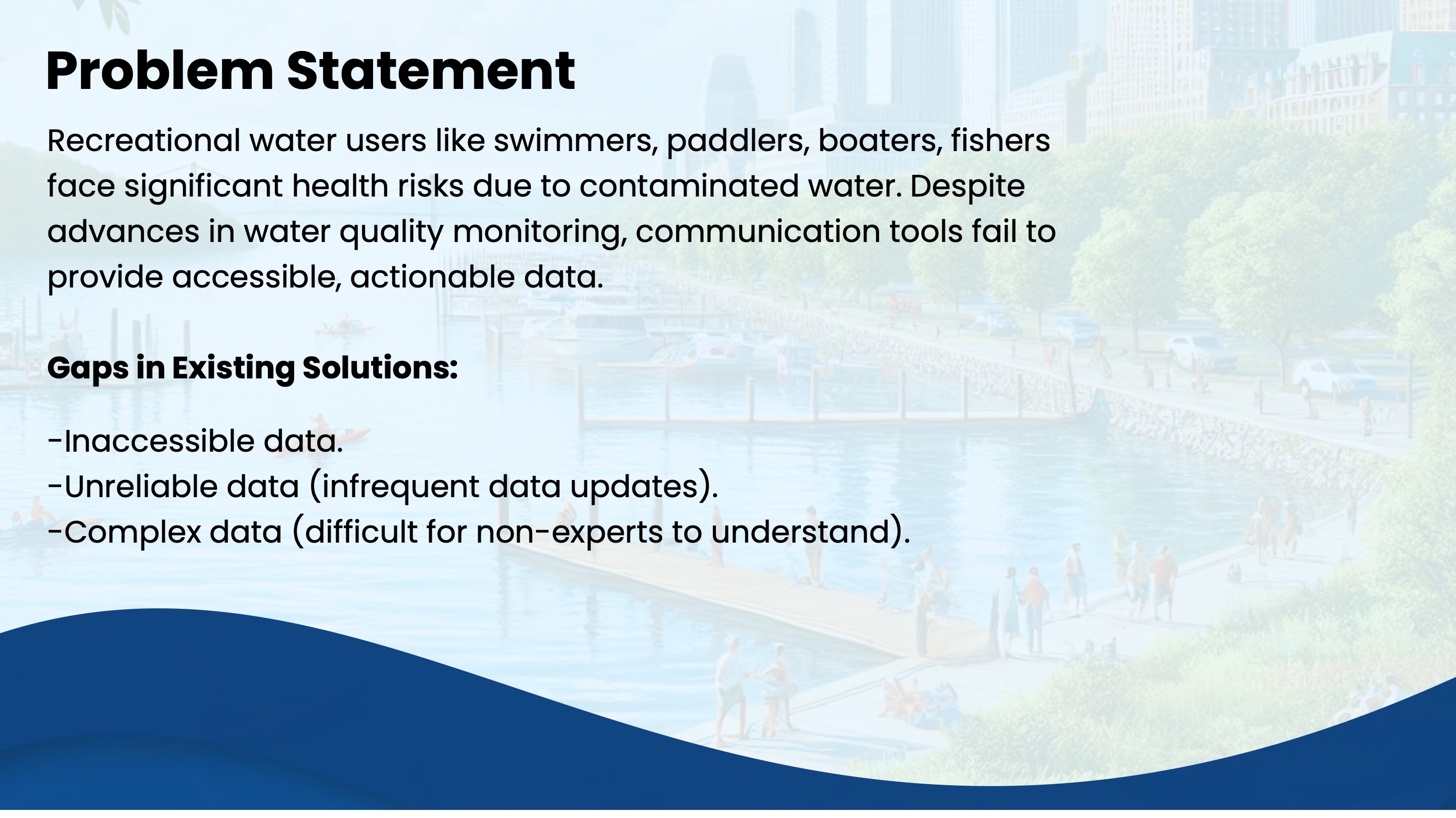
The main problem was not just the lack of water-quality data — it was the way that data was communicated. Existing solutions often showed complex metrics, infrequent updates, or information that was difficult for non-experts to understand.
Design challenge
How might we help recreational water users easily access accurate, understandable, and actionable water-quality information to ensure their safety?
4)Research, Users & Key Insights
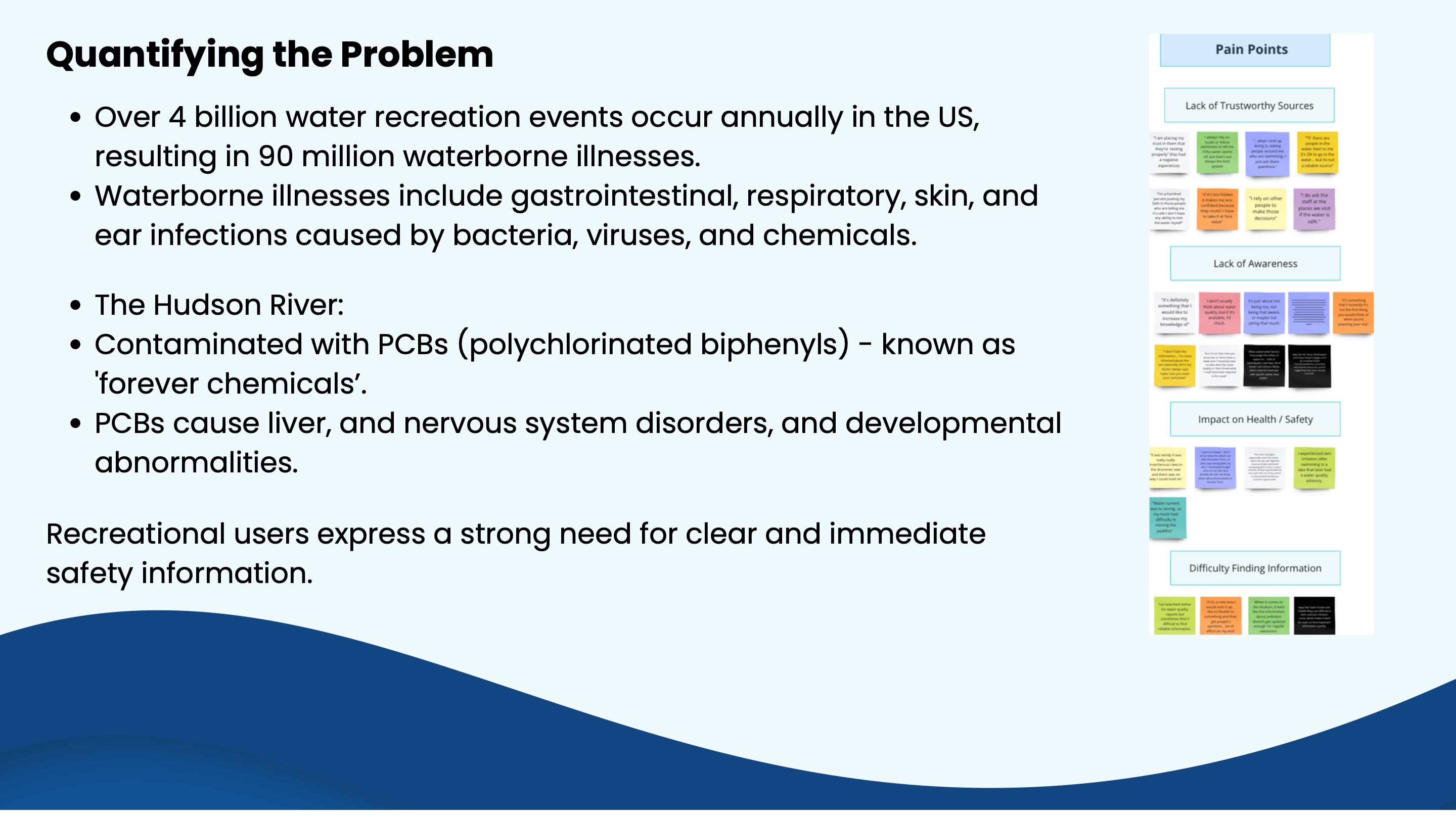
The research process included literature review, competitive analysis, user interviews, usability testing, and a field study. We focused on recreational users who interact with the Hudson River through swimming, paddling, boating, kayaking, and fishing.
Key insights
- •Users wanted a clear good / moderate / bad answer
- •Users wanted temperature, tides, and relevant river conditions
- •Users wanted detailed information only when needed
- •Users wanted to check conditions in advance and know how water was tested
- •Users wanted to report conditions and read other people's experiences
- •Users disliked jargon, outdated data, long text, and unclear navigation
5)Solution & Product Concept
Fluid is a location-based mobile app that helps users check water quality, understand current river conditions, and report local experiences. The app translates technical water-quality information into a clear visual status system supported by plain-language guidance.
Three key moments
- •Check status — immediately see whether the water is good, moderate, or unsafe
- •Understand details — view temperature, tides, forecast, testing info, and metrics
- •Contribute reports — post condition updates, photos, and experiences for the community
6)Key Features & Interaction Flow
Core features
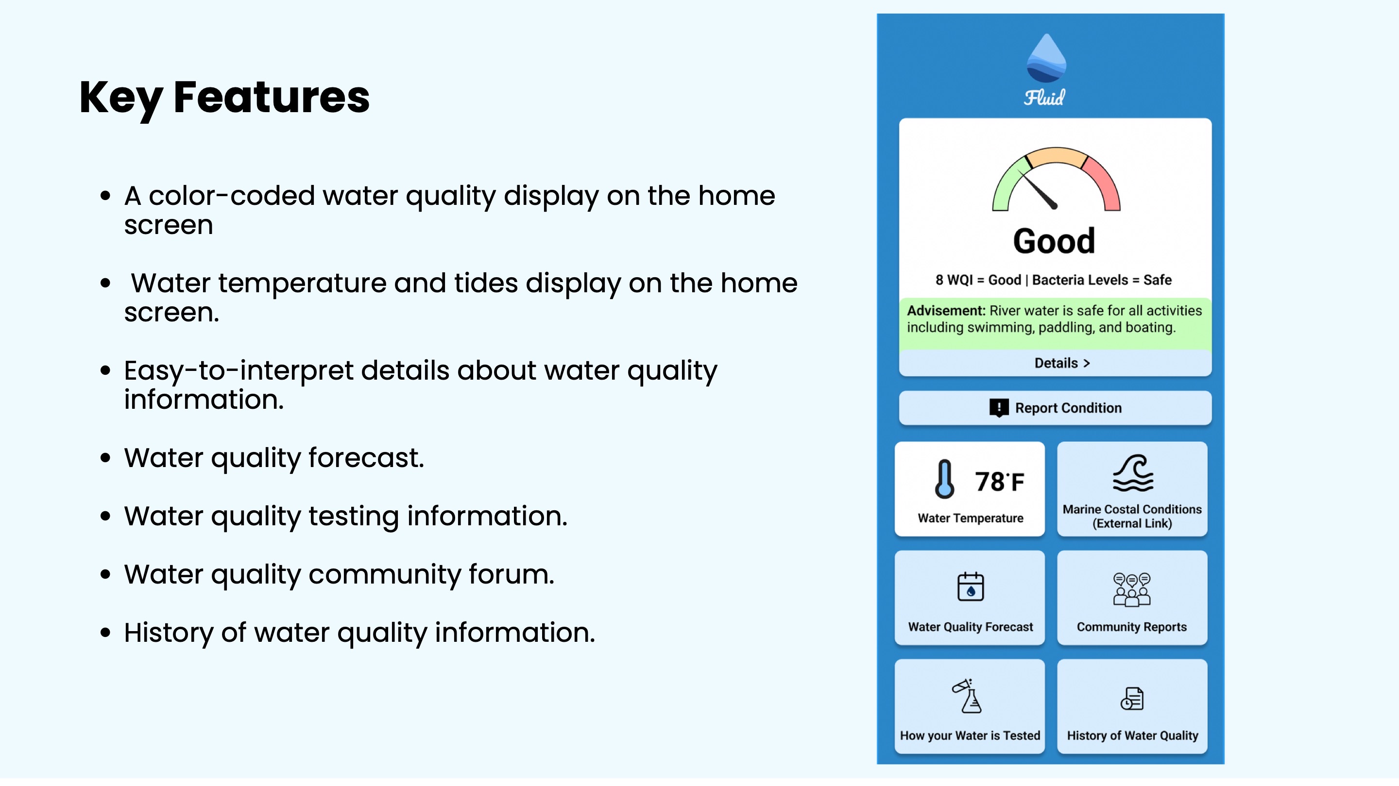
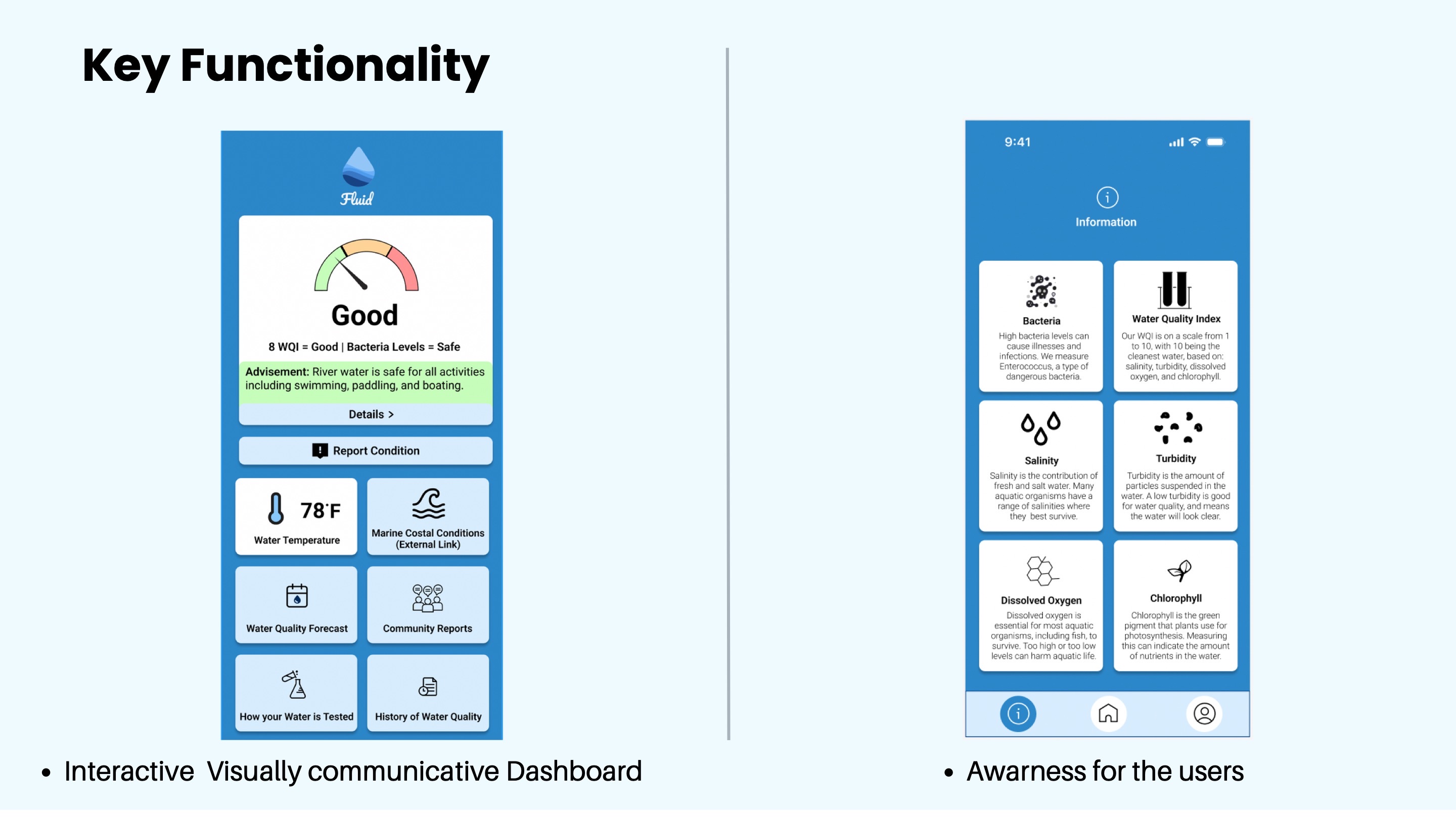
- •Color-coded water-quality status on the home screen
- •Good / Moderate / Bad safety state with plain-language advice
- •Water temperature and tide snapshot
- •Water-quality forecast for planning future activities
- •Details page for bacteria, WQI, turbidity, salinity, dissolved oxygen, and chlorophyll
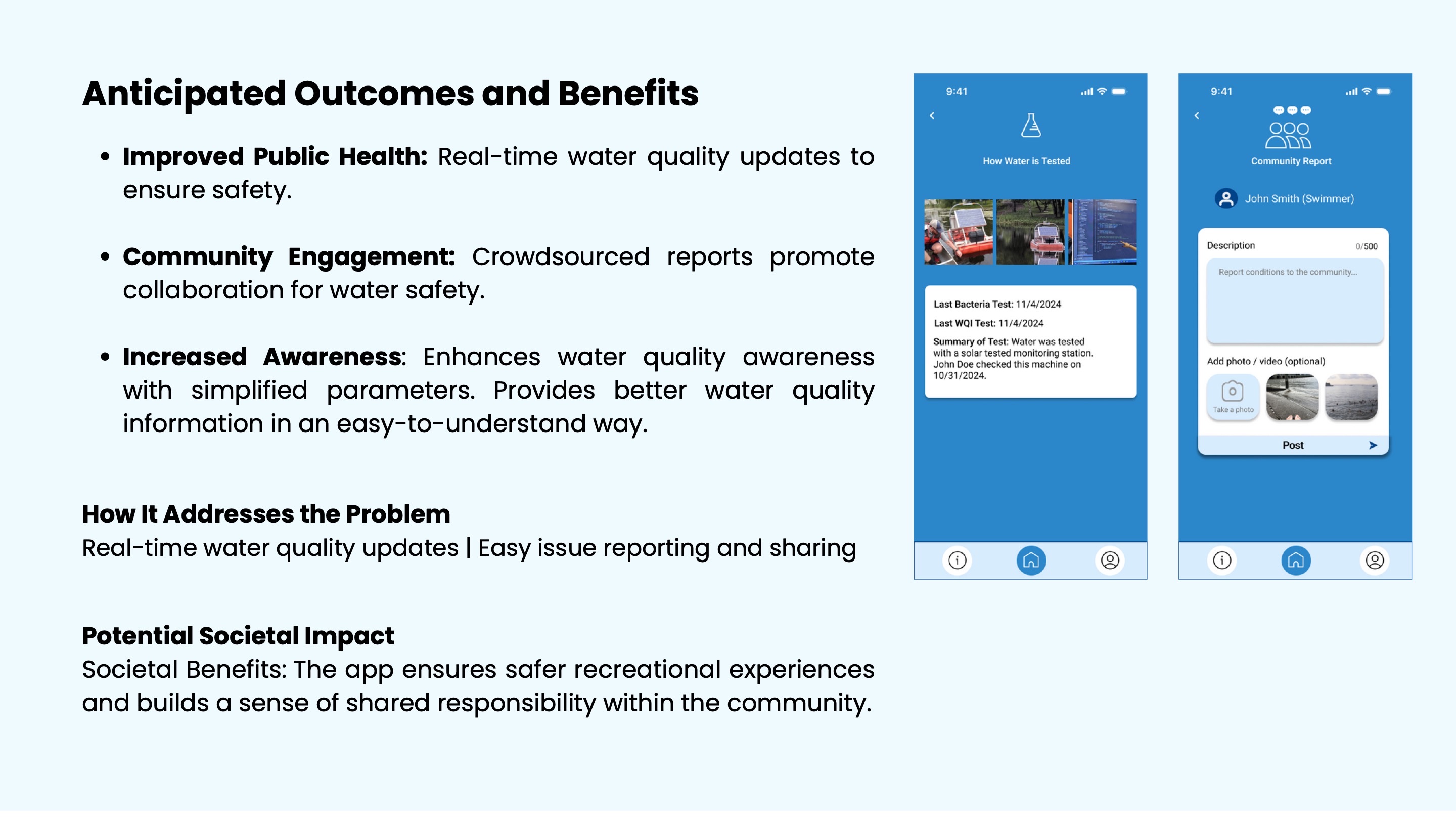
- •"How Your Water Is Tested" section to build trust
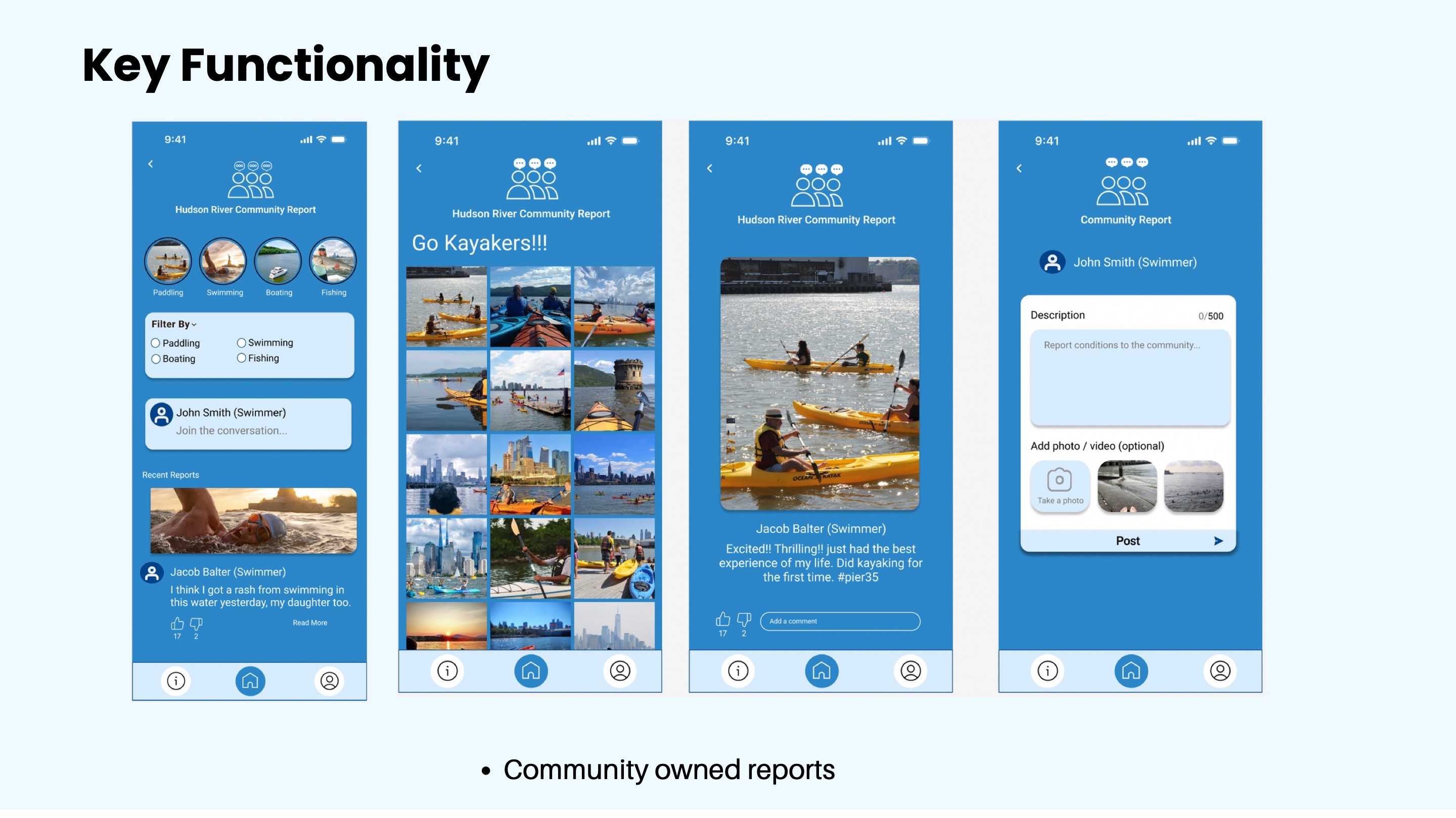
- •Community report feature with activity filters and user posts
- •Report Condition flow with photo or video upload
- •History of water-quality information and bottom navigation
User journey
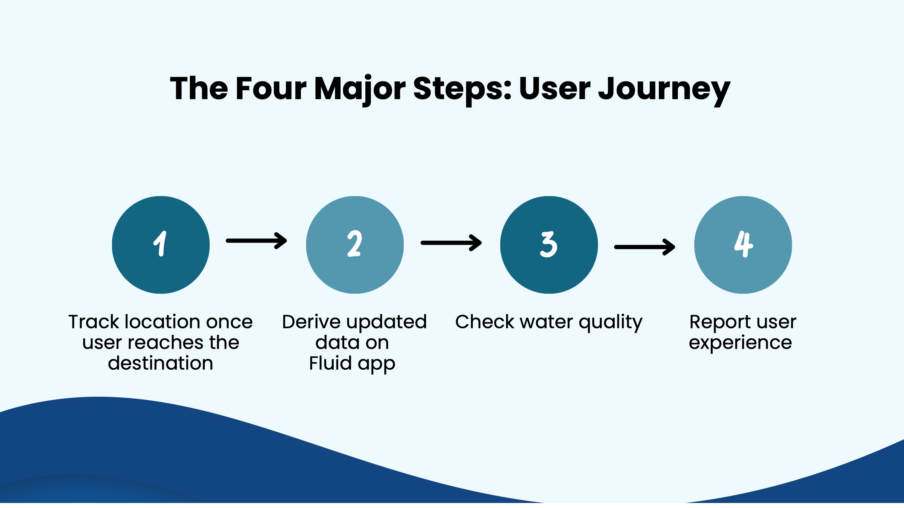
The user journey follows four major steps: tracking location, receiving updated data, checking water quality, and reporting personal experience.
7)Testing, Iteration & Design Decisions
After the first design iteration, we conducted usability testing to evaluate whether users could find pH levels, forecast information, and testing information. Testing revealed that some parts of the app were not intuitive enough, especially the forecast path, bottom navigation icons, and homepage hierarchy.
Second iteration improvements
- •Made the homepage easier to scan with a clearer water-quality meter
- •Improved color-coded safety advice and simplified bottom navigation
- •Added a dedicated forecast button with a calendar icon
- •Improved icon consistency, visibility, and access to key information
Field study
Later field testing showed that many users found the app intuitive and easy to navigate. Participants especially valued the community feature, forecast feature, water-quality meter, and simplified explanations.
8)Outcome & Reflection
The final outcome was a mobile app concept that makes water-quality information more accessible, understandable, and useful for Hudson River recreational users. Fluid supports safer decision-making by combining real-time status, environmental context, educational content, and community reporting.
Reflection
This project strengthened my ability to design for complex data communication, public safety, environmental awareness, and mobile usability. It taught me the importance of designing not only for information access, but for trust — users need to know what the data means, where it comes from, and how recently it was updated.