Environmental Graphics — Café Installation
A modular, low-cost wall feature made from colored paper cups that gives a café a playful, memorable identity rooted in everyday Indian café culture.
- Year :
- 2021
- Course :
- Environmental Graphics (Academic)
- Role :
- Concept, research, spatial planning, prototyping, fabrication, install
- Project Duration :
- 3 weeks
1)Brief & Objectives
Deliverables
Concept note, color explorations, SketchUp model, full-scale wall installation, process documentation
Tools
SketchUp, Illustrator, hand prototyping, paint, thermocol, stapler, paper cups
The ask
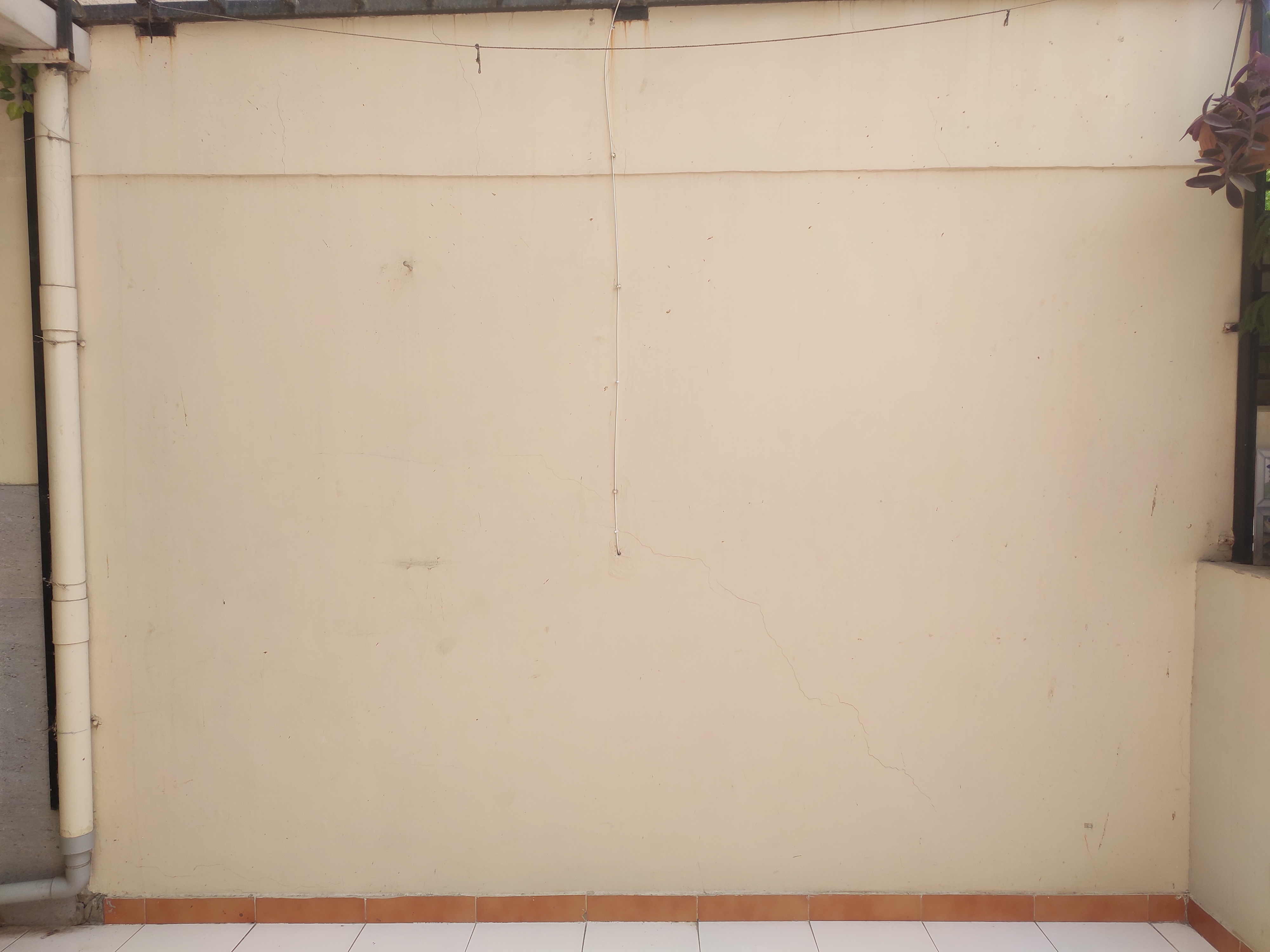
Design site-specific environmental graphics for a selected space. I chose a café and set these goals:
Audience
Café customers and passersby — a wall they remember and photograph: bold color, structured repetition, soft planting, and warm lighting.
Goals
- •Create a distinct visual identity without using the usual “coffee word cloud” clichés (beans, cups, vinyl discs, random quotes).
- •Use affordable, easily available materials and a repeatable module so it scales to different walls and budgets.
- •Shape a multi-sensory experience (visual rhythm, color warmth, subtle greenery) that feels cozy by night and fresh by day.
- •Deliver a full process: space study → concept → visual explorations → prototyping → 3D model → final build.
Outcome snapshot
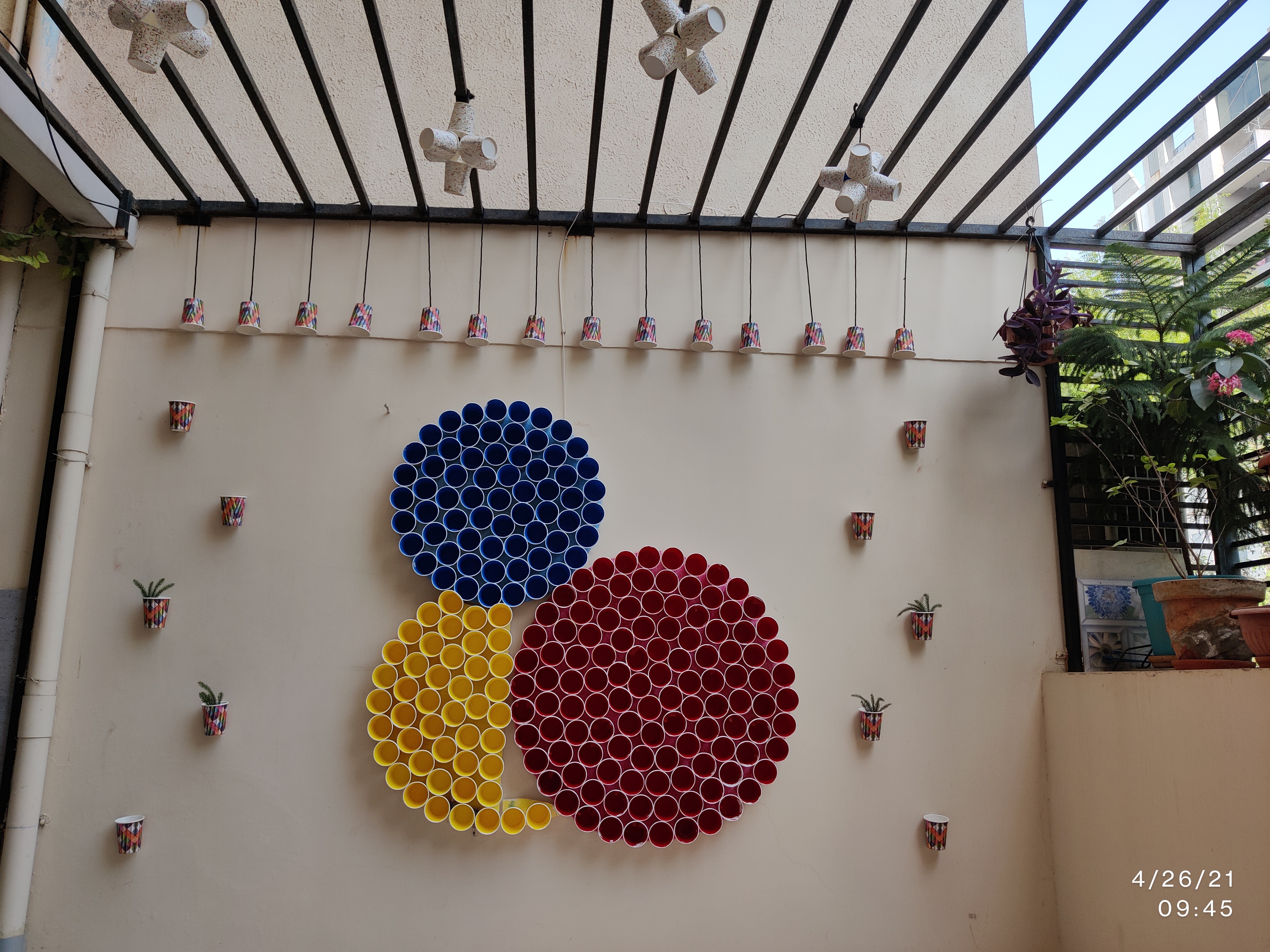
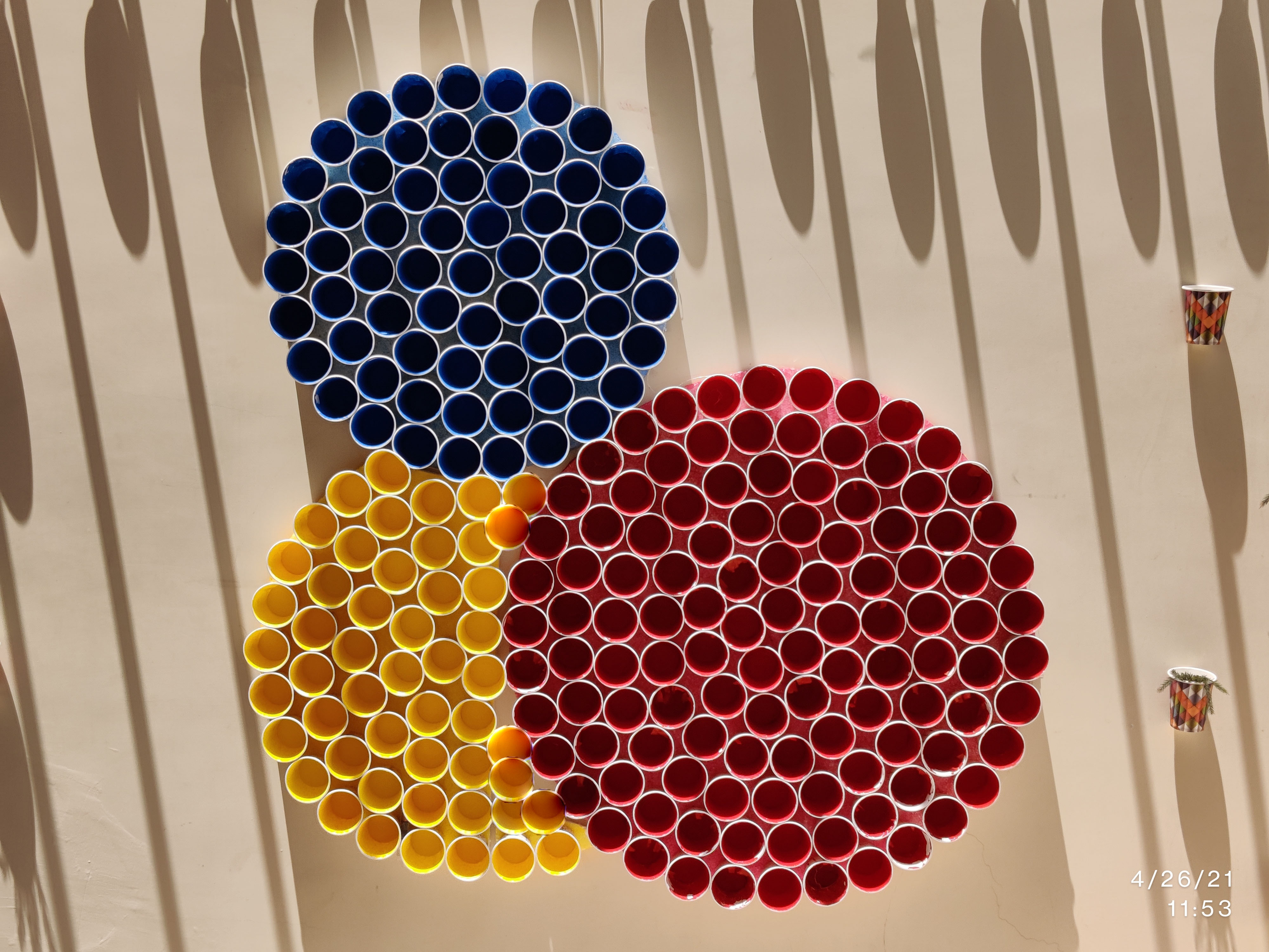
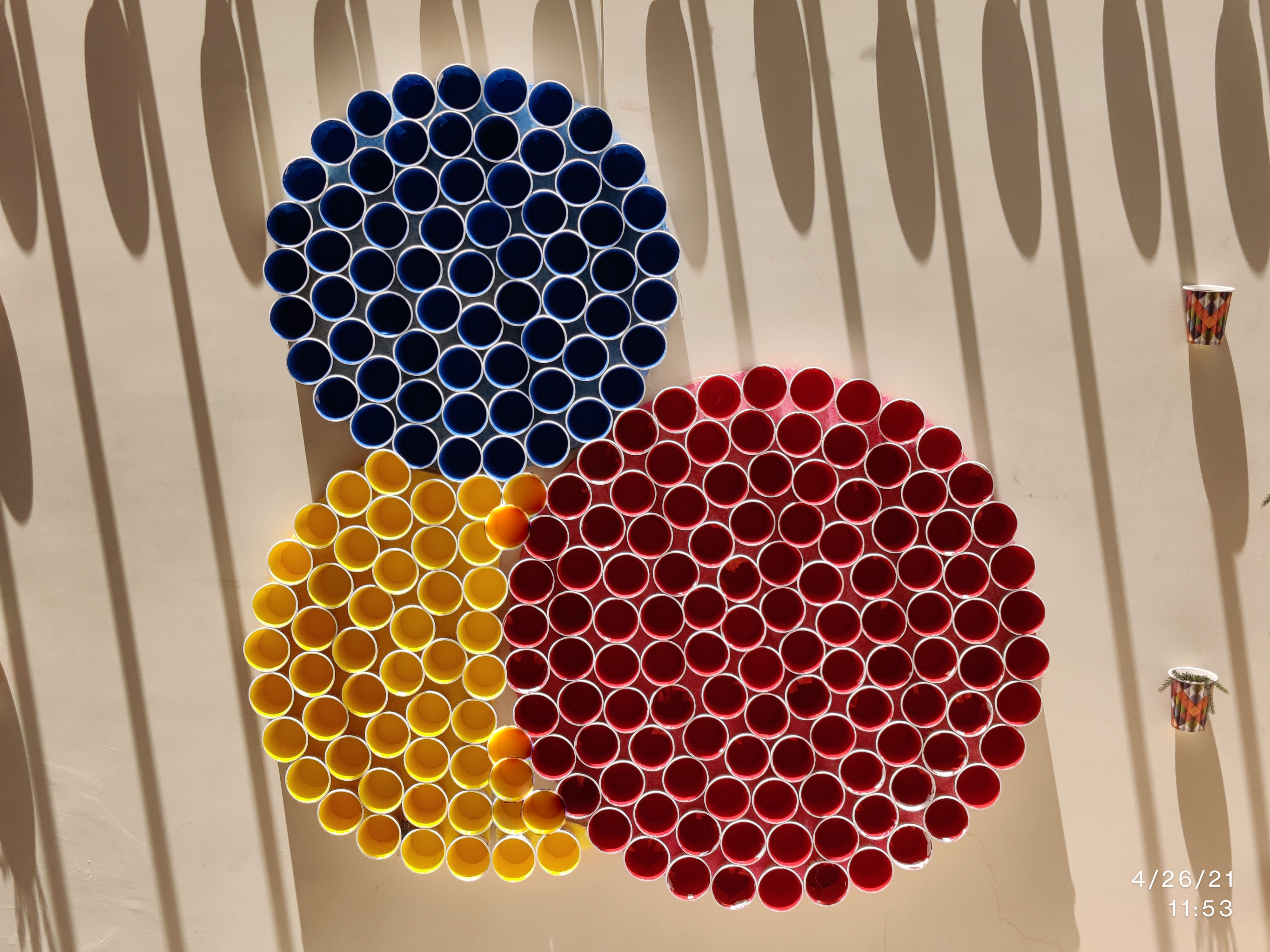
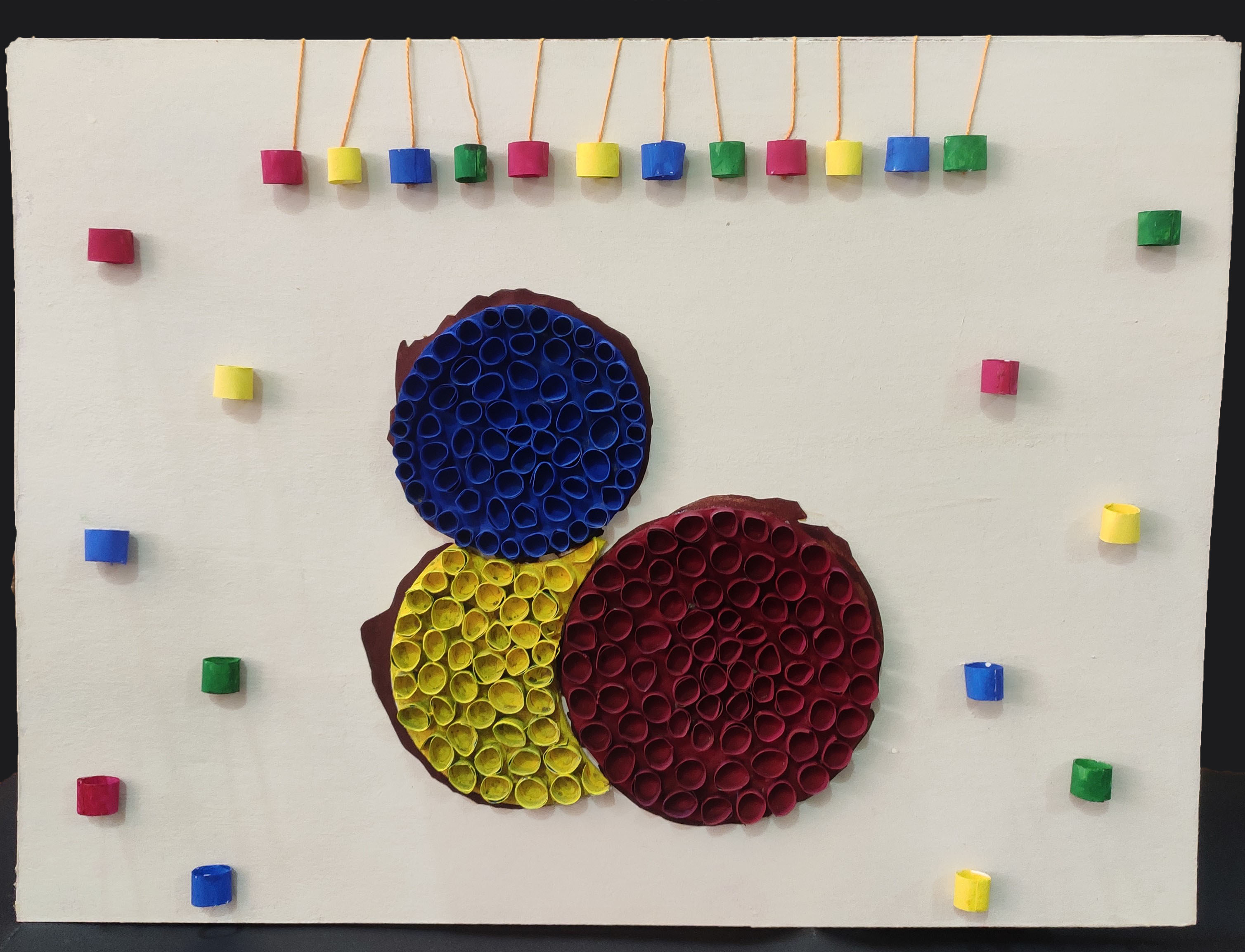
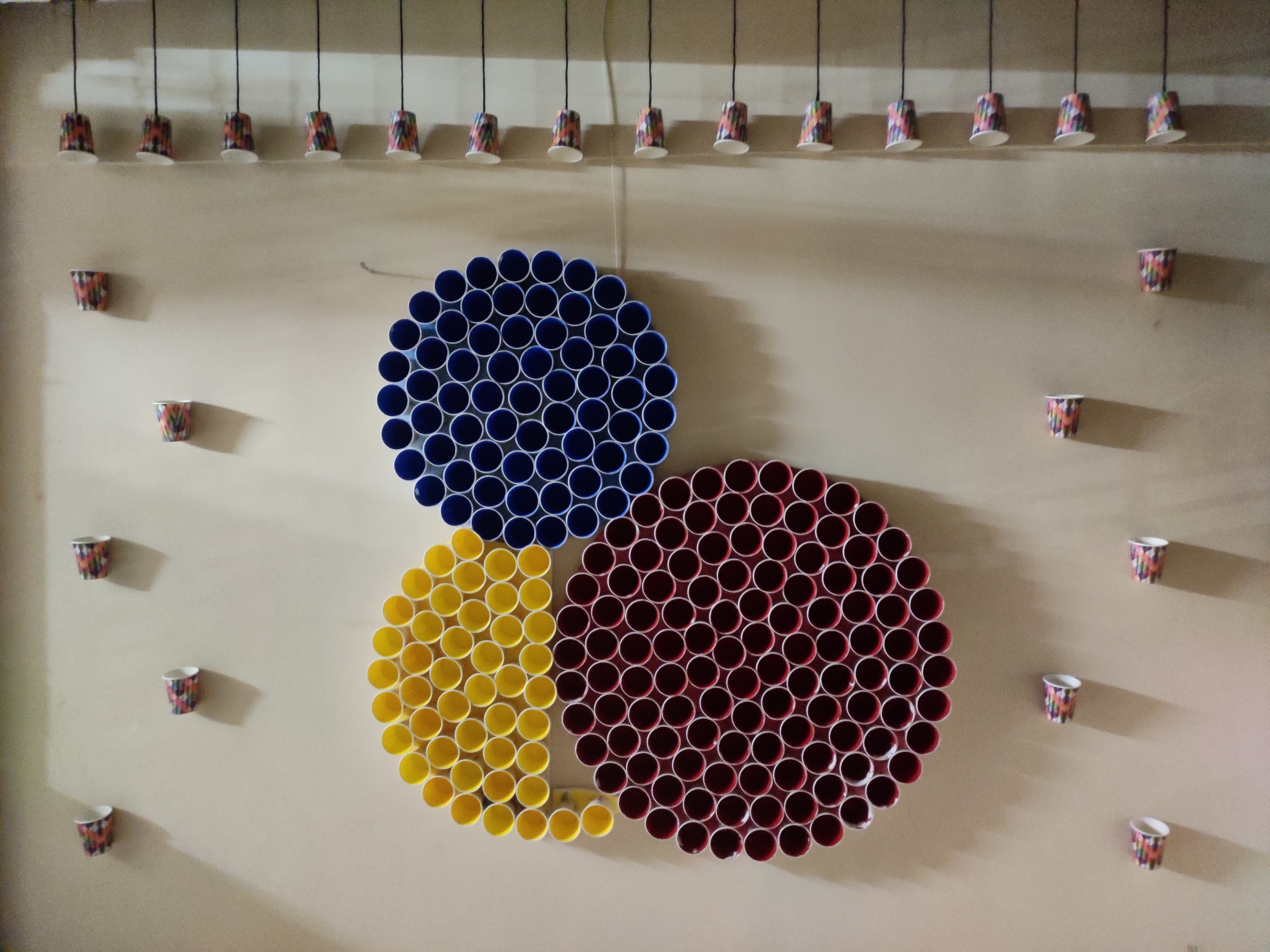
A modular, low-cost wall feature — “Circle of Cups” — made from colored paper cups that gives a café a playful, memorable identity rooted in everyday Indian café culture.
2)Context & Insight
Cultural insight
In Indian street cafés and tea stalls, paper cups are everywhere—humble, iconic, and instantly relatable.
Design opportunity
Most café interiors lean on predictable graphics. A material-first, modular approach could stand out while staying cost-efficient and maintainable.
Core inspiration
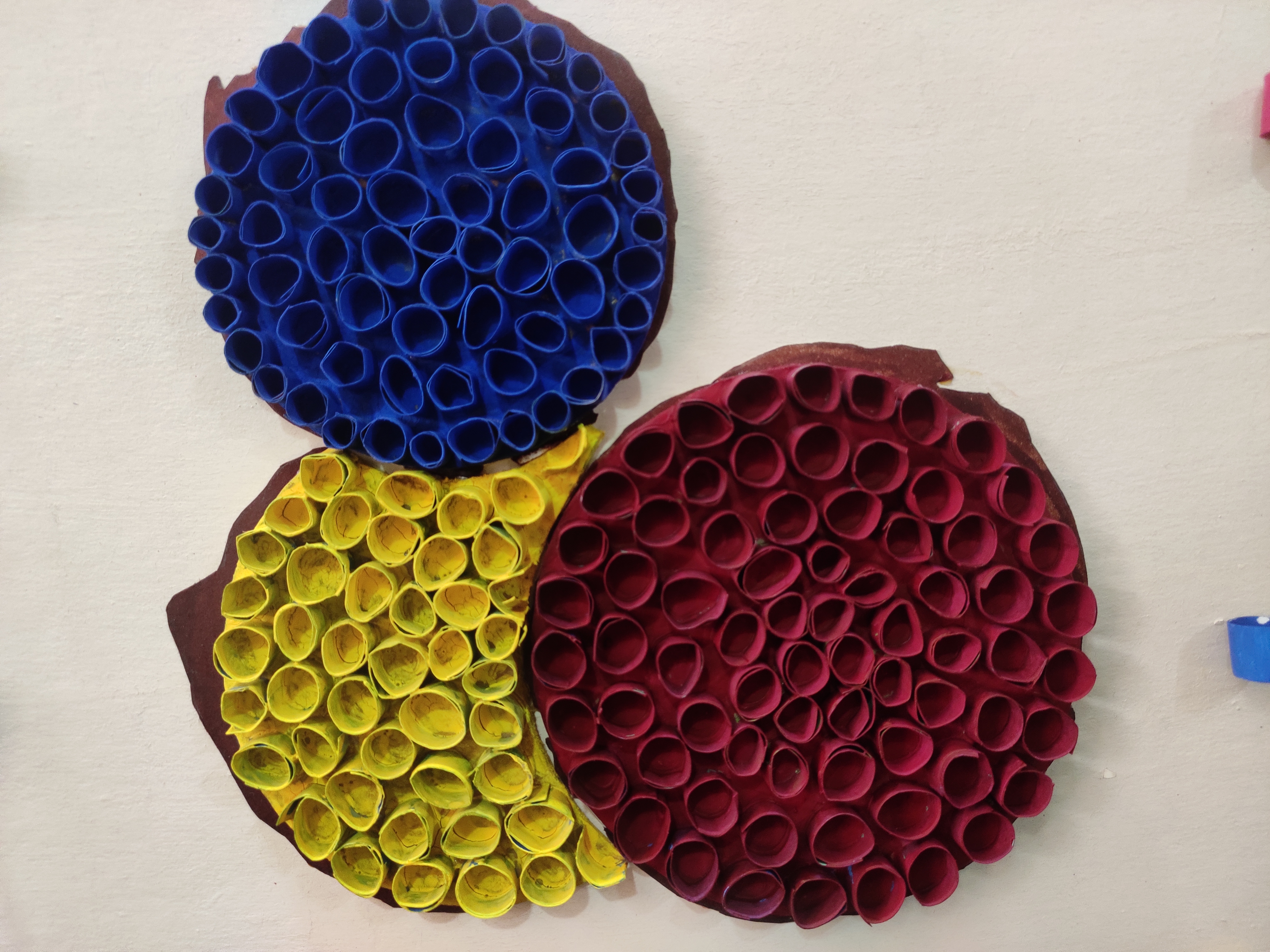
The top view of a paper-cup forming machine inspired the core visual: three intersecting circles of different diameters—simple geometry with strong recall.
Target experience
A wall that customers remember and photograph: bold color, structured repetition, soft planting, and warm lighting—Instagrammable but purposeful.
3)Concept & Rationale
Concept name
“Circle of Cups”
Core move
Build three joined circular forms from painted paper cups and mount them onto a pre-colored thermocol base.
Why it works
- •Material narrative: Elevates a quotidian object (paper cup) into a graphic system—craft meets culture.
- •Geometry & rhythm: Circles = friendly, continuous, and dynamic; repetition gives order and impact at viewing distance.
- •Scalability: Add/remove rings or change diameters and colors to fit new sites or seasonal themes.
Circle set (final sizes)
- •Small: Ø 2 ft
- •Medium (half circle): Ø 2.4 ft
- •Large: Ø 3 ft
4)Visual Language & Materials
Palette (final counts used)
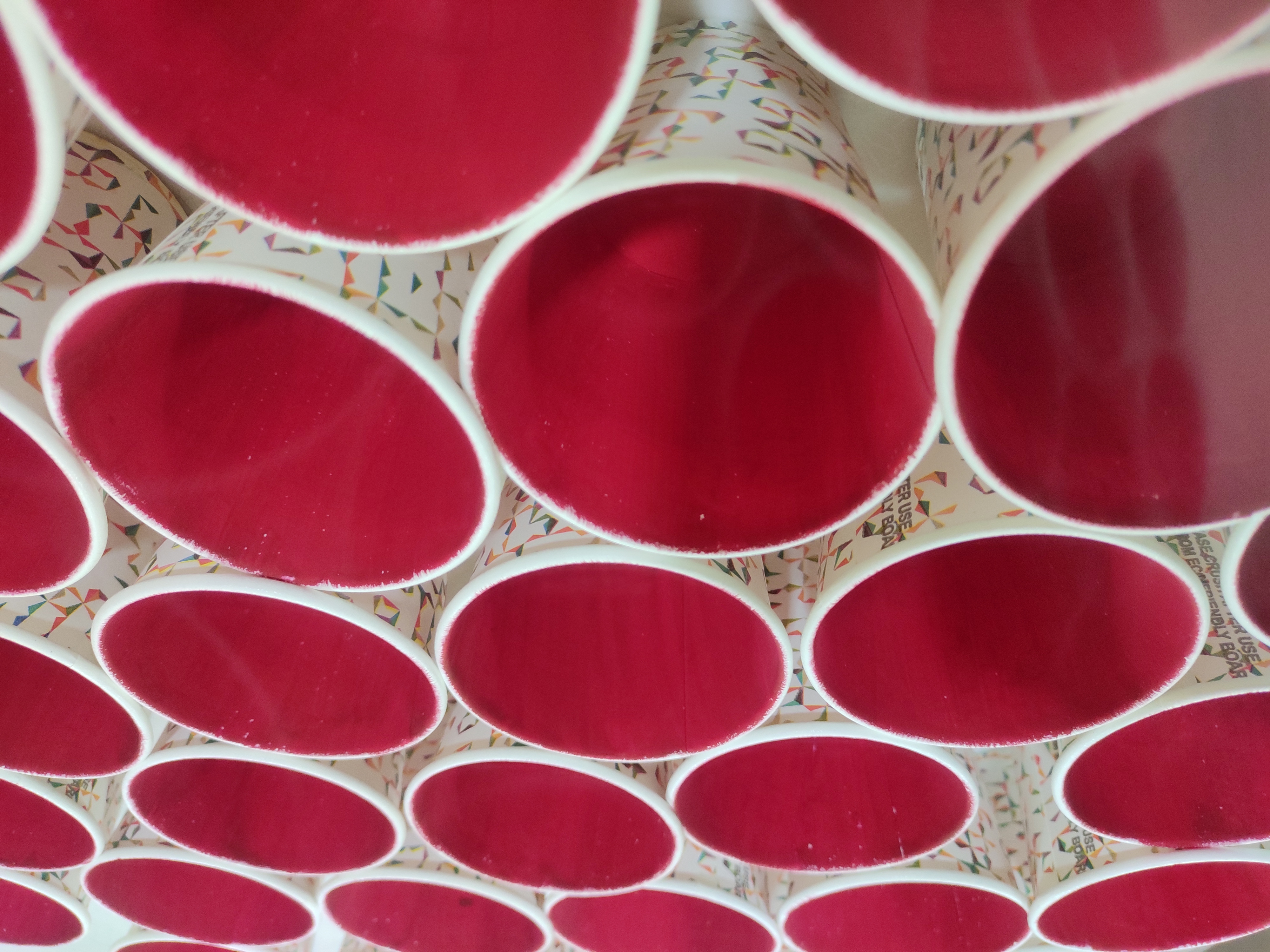
- •Red: 115 cups (energy, focal draw)
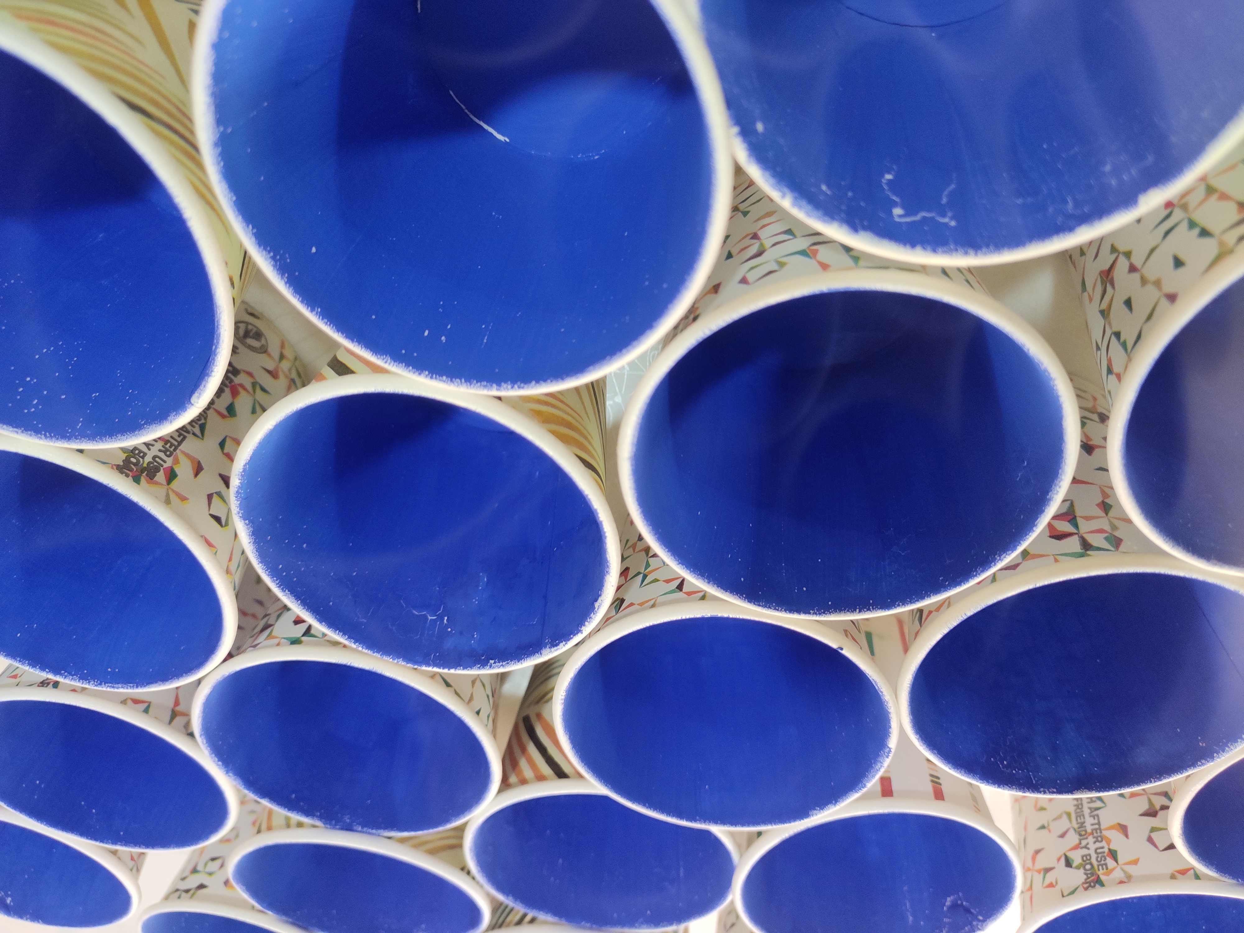
- •Blue: 66 cups (balance/coolth)
- •Yellow: 45 cups (warmth/contrast)
Materials
- •Paper cups (primary module)
- •Thermocol base, pre-painted to match background tone
- •Craft staples/adhesives for modular clusters
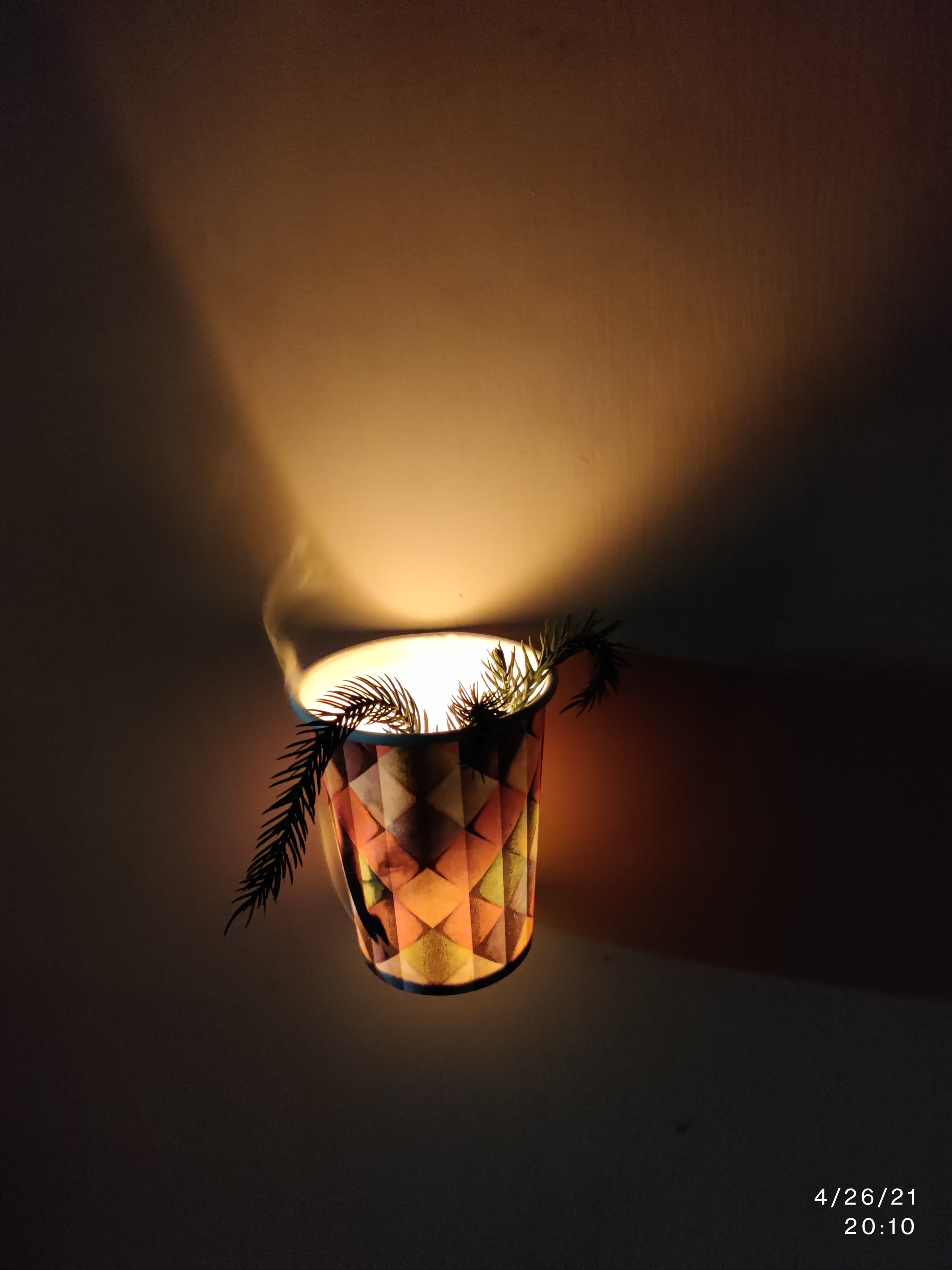
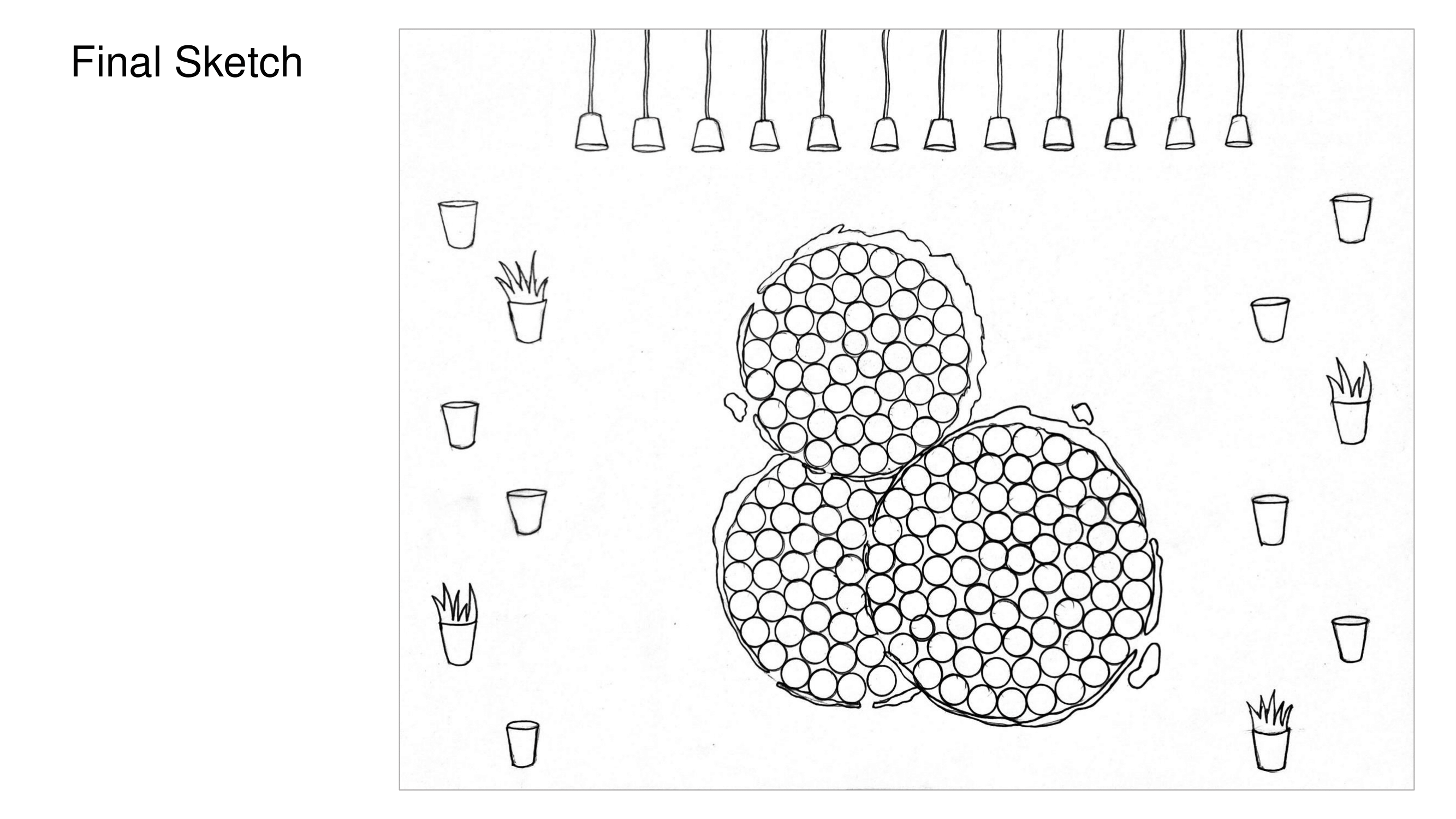
- •Potted plants (side pockets) for a green accent and light aroma
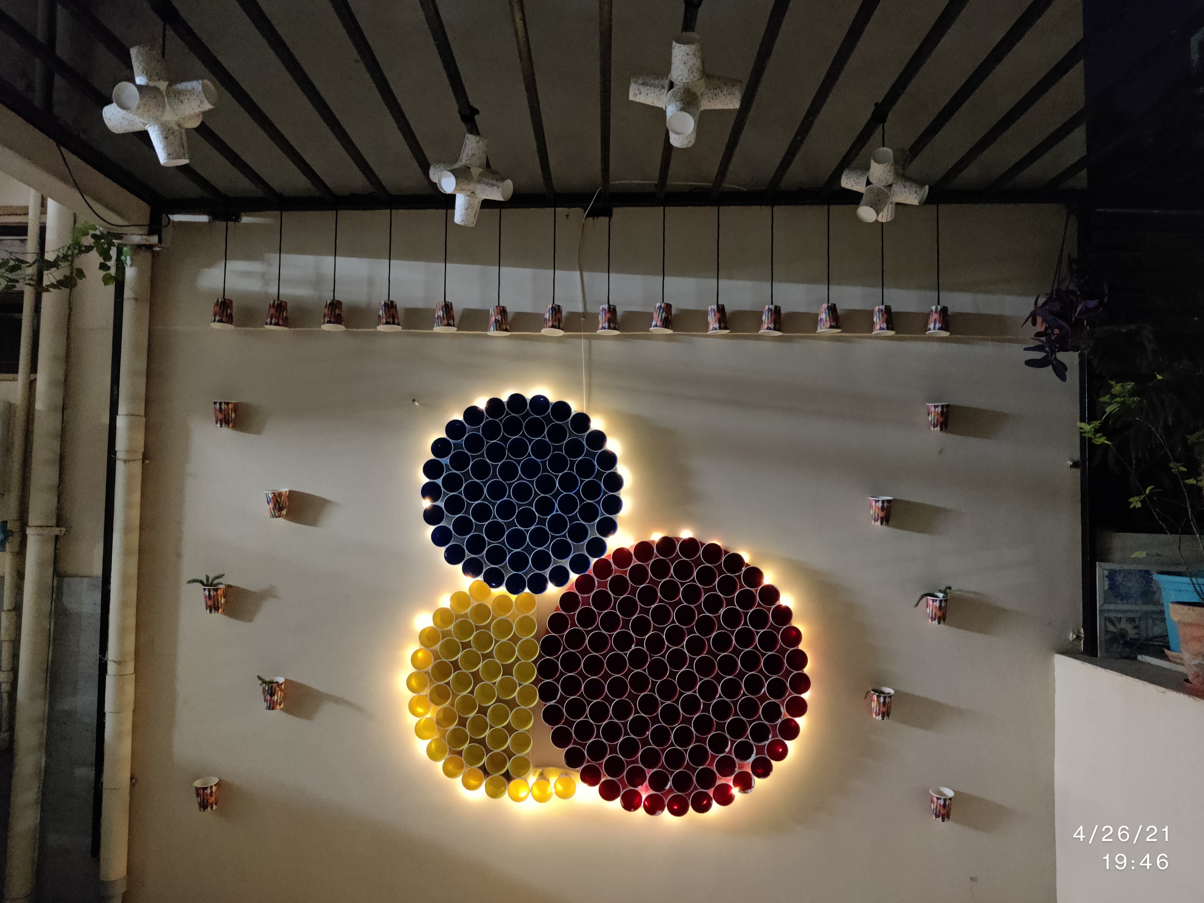
- •Warm lighting to enhance cup relief and evening mood
Typography/graphics
None on the wall—form and color do the talking. (Menu and wayfinding can pick up the circle motif elsewhere if needed.)
5)Development: Explorations → Prototype → Model
Sketch & mooding
- •Studied alternate café precedents but intentionally avoided literal coffee iconography.
- •Explored line-art, foliage, and pattern references; settled on pure geometry + color + module.
Prototyping (table-top scale)
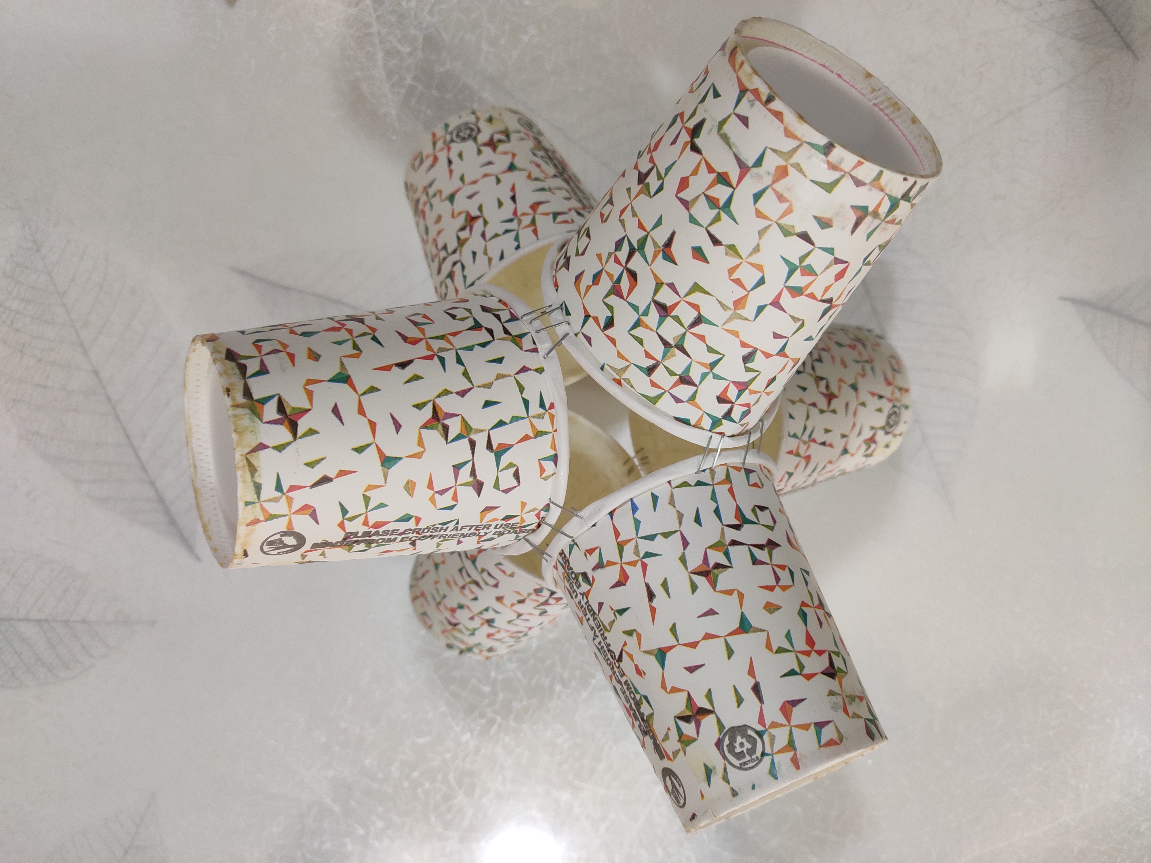
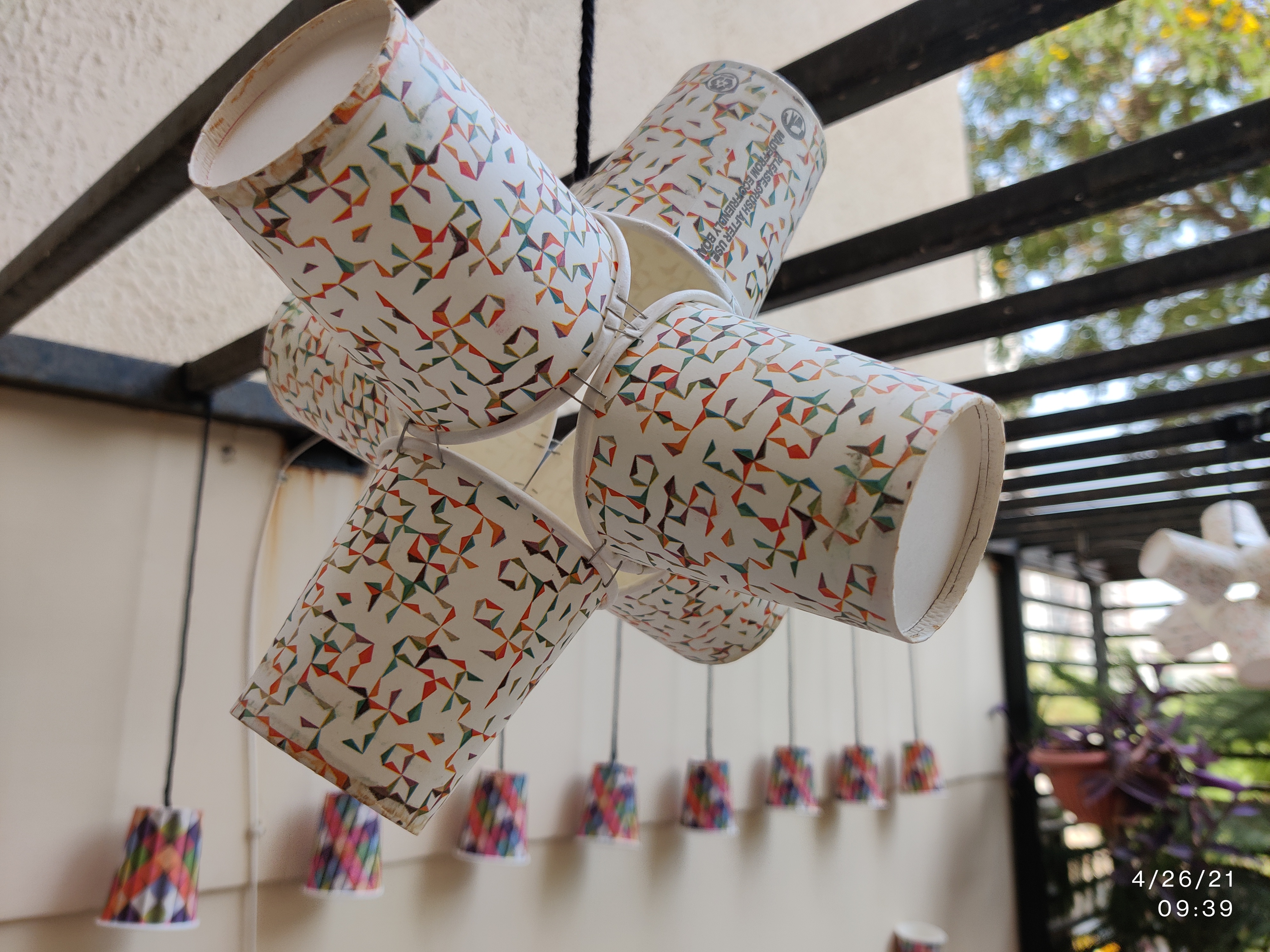
- •Join 2 cups → add a 3rd → build two triads → staple together to form stable hex-like clusters.
- •Tested ring curvature and packing to estimate cup counts per diameter.
- •Paint tests to validate saturation, light falloff, and readability under warm LEDs.
3D planning
SketchUp model to test wall placement, circle overlap, and viewer sightlines from different café zones.
6)Fabrication & Installation
Pre-build
- •Paint thermocol base; mark circle centers and ring guides.
- •Paint cups in batches; dry and sort by color.
Assembly
- •Build clusters with a stapler (fast, light, repairable).
- •Form rings and fill circles from outer ring inwards for cleaner edges.
- •Mount to base, then the base to wall (minimize on-site mess/time).
- •Add planter pockets on side locations for greenery.
- •Aim warm lights to rake across the relief, creating evening depth.
On-site checks
- •Line quality, cup alignment, and color balance at 1–3 m and >5 m viewing distances.
- •Verify plant placement doesn’t cast harsh shadows or obstruct service paths.
7)Outcome & Learnings
What it achieves
- •A memorable focal wall that feels bespoke to café culture without text clichés.
- •Low-cost, low-waste: off-the-shelf modules; easy to repair, recolor, or re-arrange seasonally.
- •Photogenic relief and color blocking that encourages sharing (earned media).
What I learned
- •End-to-end execution (space audit → system thinking → prototyping → install) is crucial—every small decision scales at wall size.
- •Modularity wins for speed, cost, and maintenance.
- •Lighting and planting are not afterthoughts; they complete the spatial story.
- •SketchUp saved time by catching proportion issues before fabrication.